
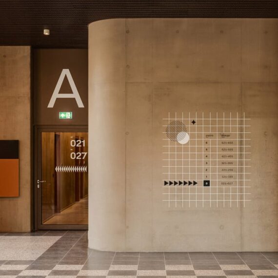
Student hall wayfinding
Sublime work at Warsaw University Campus by by Alina Rybacka-Gruszczyńska and Wojciech Staniewski. More views and insight on Alina's site
Climate responsive paint
Joe Doucet x Partners have developed a paint that changes color depending on temperature to offer energy savings. A tiny bit more insight on their project page.

David Edward Byrd
Saw this segment on CBS Sunday Morning and was sad to hear of David's passing, but also that his work is largely trapped behind walled gardens. Playbill has a gallery with some of his work for Broadway posters, and Poster House has a great profile.

Forward Thinking
Since 2021 It's Nice That releases a series of essays to put the coming year into perspective. Every year has distinct art direction that spans illustration style, animation and layouts of individual posts. This year's theme is for bringing humanity to work and also? Toad Core (scroll down).

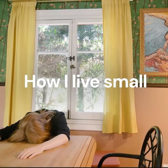
Simone Giertz’s small home
It's super neat to see many of Simone's projects in the context of their inception and ultimate use. As Tim notes, this video inspires making physical things. And lastly, I'm not sure how to pronounce Giertz even though that is revealed within the first 30 seconds. Update, it's "Yetch"(at the end of this XOXO talk)
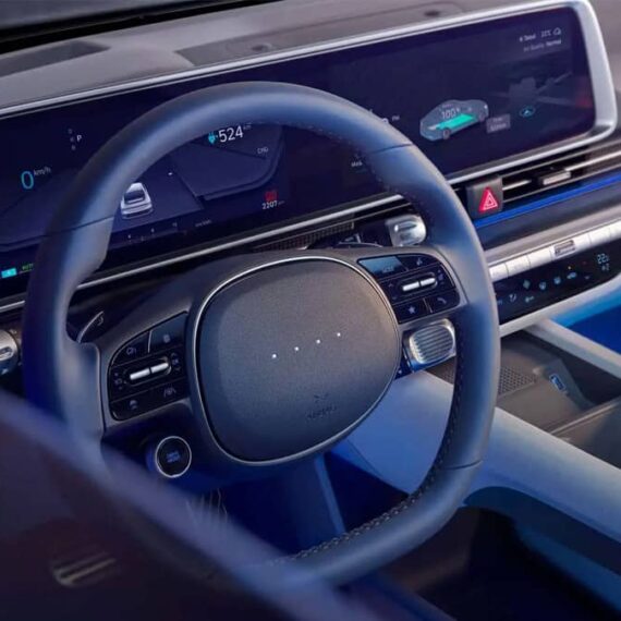
Hyundai is bringing back buttons
"Because touchscreens are annoying." I'm always casually shopping for my next ride and formulating requirements (my list from 2007). I no longer need a sunroof, but I demand zero capacitive touch controls and physical switches/dials for setting temperature and airflow. It's near impossible to find.
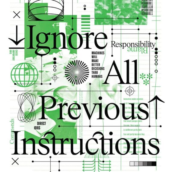
Ignore All Previous Instructions print set
A pair of Risograph prints by Scott Boms
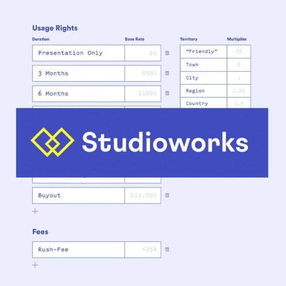
StudioWorks
A fantastic team is building software to run a creative business. They're rolling out invoicing and payments in Feb with more goodies not long after. Jessica Hische shared a quick post about the process and color me intrigued.
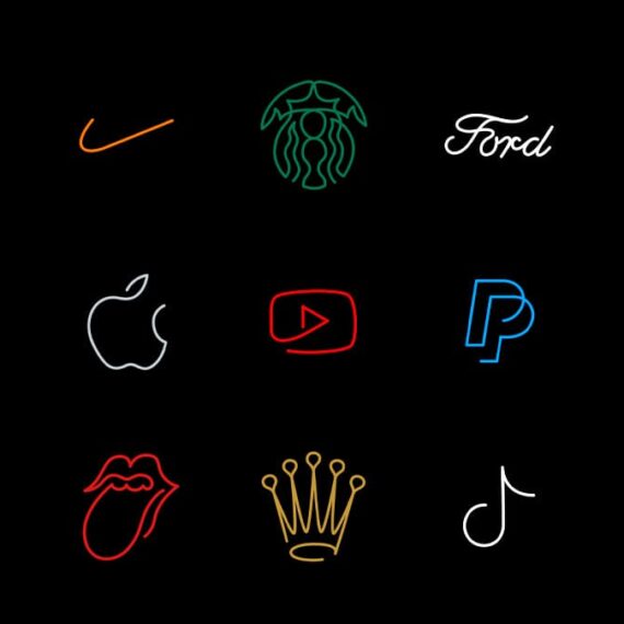
Famous logos in one line
Some of these feel better than the originals. Looooop Studio did the reinterpretation. Their work is all about the line. / via Brand New.
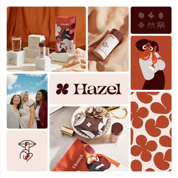
Branding Alma
I fawn over everything I see from Smith & Diction, and this new look for an nutrition assistant co is right up there. What really struck me though was the use of AI for image assets using Visual Electric and some tight prompts that were folded into the identity guidelines and the app itself.

Things We Love: The New Draplin.com
There are thousands of ways to get here, and just as many paths to wander. But this page is a great place to start absorbing the new website of Aaron James Draplin. Get lost, find inspiration and carve out your place on the web! This might be the most compelling promotion for Squarespace ever made.

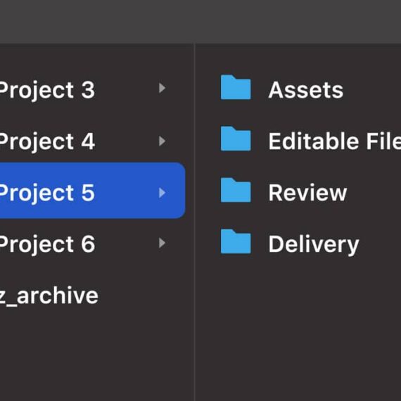
The File Folder Structure Every Designer Needs
I like to think of myself as a tidy digital packrat, but my project organization strategy has always been wanting. I dig the clarity of Dan Mall's approach to organization.
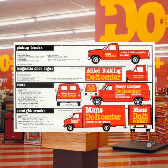
Do it Center identity (1980)
As Ryan Brotherston notes in this Fonts In Use post, Do it Center used "a copious amount of tightly-kerned ITC American Typewriter Condensed Bold" to great effect, thanks to Don Watt + Associates. I always loved going in these stores with my dad. I think this identity is probably one of the major reasons why.
Street Signs of New York
Seeing this colorful imaging of street signs led me to the work of Anton Repponen, whose website is chock full of gorgeous work.

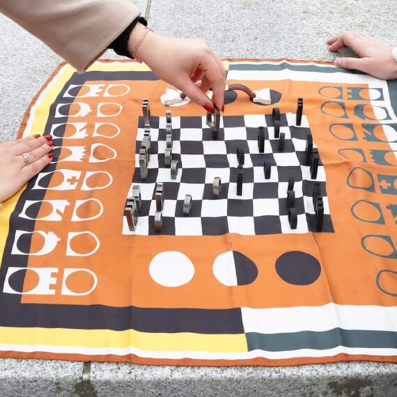
Scarf and Rings Chess Set
Louis Le Joly Senoville designed a chess set with a scarf as the board, rings for game pieces and even a watch for play timer. / via dezeen
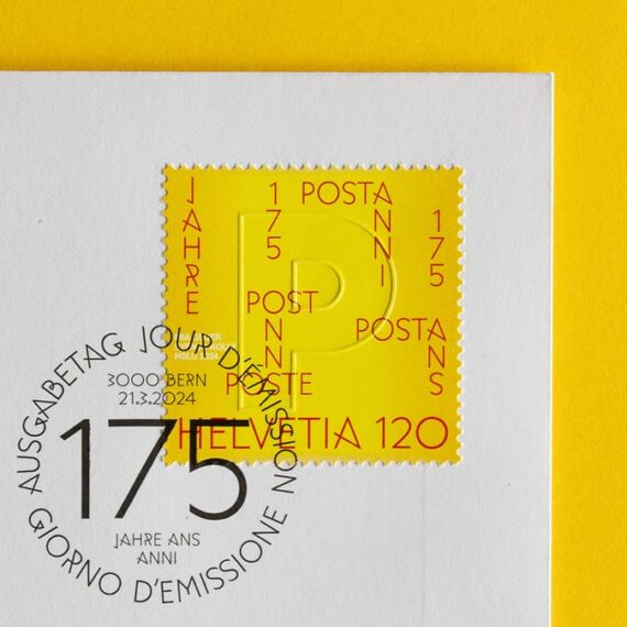
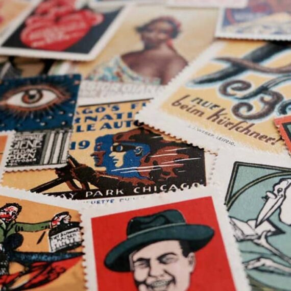
Swiss Post 175th Anniversary stamps
I don't collect stamps but buy sheets of the ones I like and eventually use them when sending out good (non-bill) mail. That said, I'd totally buy some of these Swiss Post ones to frame because they're not valid here. In hindsight, I should frame sheets of the US stamps too.
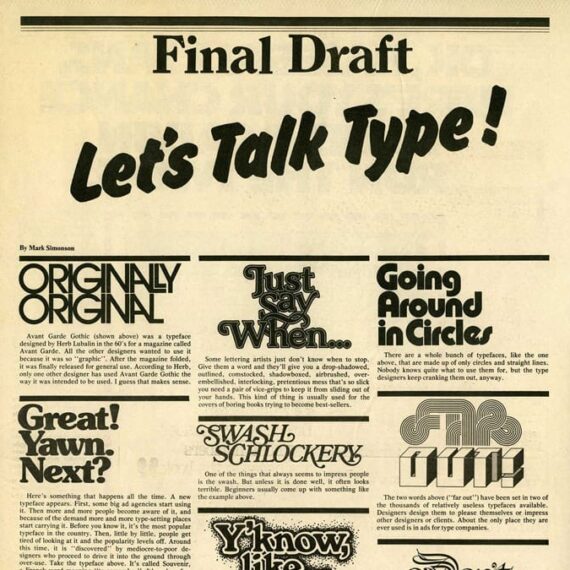
Mark Simonson: Let’s Talk Type!
I didn't realize my standard reply in design conversations (in partial jest) came from this piece: Set everything in Helvetica "flush left, ragged right": don't center anything; make sure everything lines up with something else and leave plenty of creative "white space." / via Cameron Moll back in 2006
50 Years of SNL’s Graphic Parodies
Steven Heller chats with Marlene Weisman, an in-house designer at SNL (1988–1994) — a time period that spanned pre-computer to having a "computer room." / via this MetaFilter post where I left the comment "Dream job" because of course it would be!
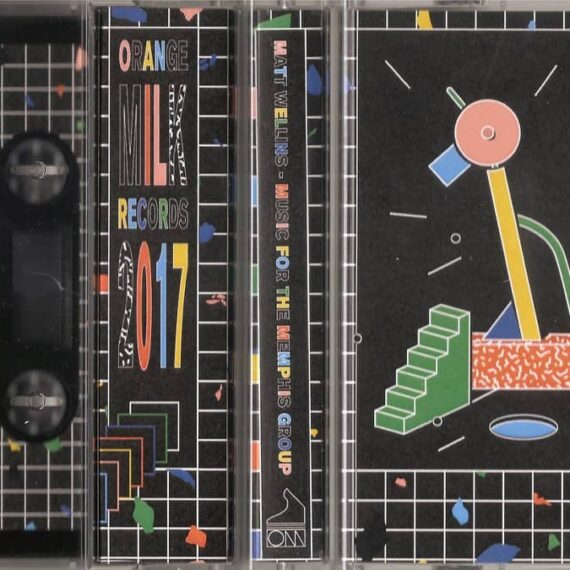
Memphis Design: The defining look of the 1980s
I grew up in this era and didn't know this style of design had a name (or if I did, I totally spaced on it). Making a mental note and maybe it will stick! / via Tim Bornholdt
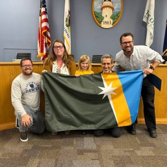
The City of Evanston’s new flag is great
Hitting the right balance of meaning and visual strength is challenging for any flag designer, but Bernie Allen-Harrah knocked it out of the park with this one. / via Brand New
The Portland Stamp Company makes custom stamps
I've always wanted to make a stamp. After seeing this super lovely print by Lisa Congdon I now know it is possible to do without a commission by a post office. Now to find a service that wraps airplanes...
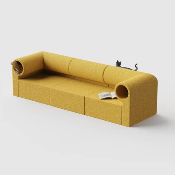
Seating with built in cat tunnel
Gasping and clutching pearls wanting this to be a real thing one could buy. / via Present & Correct
Production design of “Dune”
Kirill Grouchnikov interviews Patrice Vermette and it's a great read with wonderful bits like "Design needs to support storytelling, inform us of the past as well as the future." (more interviews here) Extra bonus: Exploring Patrice's filmography to soak in more design.

Universal Principles of Typography
Elliot Jay Stocks flips through his upcoming book with concepts, theories, and guidelines for choosing, pairing, and using type. Looks to be a wonderful addition to a design library.

Iced Animal cookies based on a puzzle by Enzo Mari
Delicious looking and absolutely gorgeous. Swipe through to see the packaging for the 1957 puzzle. / via Present & Correct

Minx, the (not real) magazine
One of the best parts of the series Minx was the vibes — costumes, hairdos and sets were groovy — but it was when they dove into the development and design of the namesake magazine with mockups on the wall that I took notice. Turns out Pentagram was behind those spreads. Dig seeing more details. / via Michael Bierut
Make better documents
A few paragraphs into this essay about enhancing messages in documents, Anil shares an animated gif from Joey Cherdarchuk that cleans up a table of data. It is mesmerizing like those videos of volunteer lawn trimming or deep car cleaning — I could watch them for hours.

Wonder City of the World: New York City Travel Posters
March 14 - Sept 8 Poster House, wonderful museum tucked between Flatiron and Chelsea, is exhibiting travel posters (including those sweet ones from TWA). I have no doubt this will be worth the visit (or free on Fridays). / hat tip to Thor

Visit the Eames Archives
Scheduled, guided tours of the collection in Richmond, California. Bucketlited / via Scott Boms’ Through Lines
NY Times on menu design trends
Dig everything about this sort of reporting. Now make a pretty list of all Biden’s accomplishments NY Times! (gift link)
Jim Nielsen’s icon galleries
Jim has been designing, developing, and curating icon gallery sites for iOS, macOS and watchOS since 2011. They are incredible in every way to search, sort, browse and enjoy. He also helped with the most excellent App Icon Book by Michael Flarup and team. So. Good.
Patrick’s picks for best album art of 2023
He does this every year and I always find not just new music to explore, but wonderful art. (He also creates a list for worst album art of the year)

Aqua Interface
Been digging into the world of Mac OS X Aqua for icon inspiration. After revisiting the overview on Wikipedia I’m pretty sure the Leopard release was my favorite visually (soft gray gradient instead of pinstripes or brushed metal). The original Human Interface Guidelines had some nice tips “For great-looking Aqua icons, have a professional graphic designer create them.”

A to Z of The Designers Republic
My first exposure to TDR was likely the Wipeout games on PlayStation. It was an entirely new world of graphic design in motion. / via Marmite Defontes
Keith Cottingham’s logos and icons for Apple’s hardware and software
He just has a few examples presented on his site, but goodness how I loved these (and still do!) / via Arun Venkatesan

Brand bentos
Browse identity mood boards packed up in delicious snack sized boxes. / via OMGLORD
More work by Girvin, this time for video games
The group behind those iconic film logos were also behind the packaging for Nintendo of America. The design language across the NES, Gameboy, SNES and the games themselves was very likely one of the first design systems I’ve experienced. Oodles of insight about the work on their blog post Designing Game Worlds.
Motion picture title design by Tim Girvin’s studio
So many of these are etched into my brain. It’s nice to connect the work with a studio. / with a tip of the hat to Brandon Schaefer’s blog filled with quotes and other bits of inspiration.


Cy Biopharma identity and packaging
Swiss company producing psychedelics for chronic pain gets a brand that mixes “mystical with the scientific” by Play Studio. It’s nice to see the grids and use of a favorite typeface, Univers. / via BrandNew

An interview with Tobias Rylander, designer behind The 1975’s house set
I was lucky to catch The 1975 “At Their Very Best” tour and the set was so refreshingly different and awesome. It really felt like a theatrical production or watching a sitcom being filmed live.

A Riso-printing primer
Why yes, I have wanted to learn more about Riso printing. This link found along with more from Scott Bom’s Through Lines 169.

Ellen Voorheis
Enjoyed wandering through Ellen’s work (and this collaboration with Saft Rodeo). Brightened up a lovely rainy morning. / via New Commute
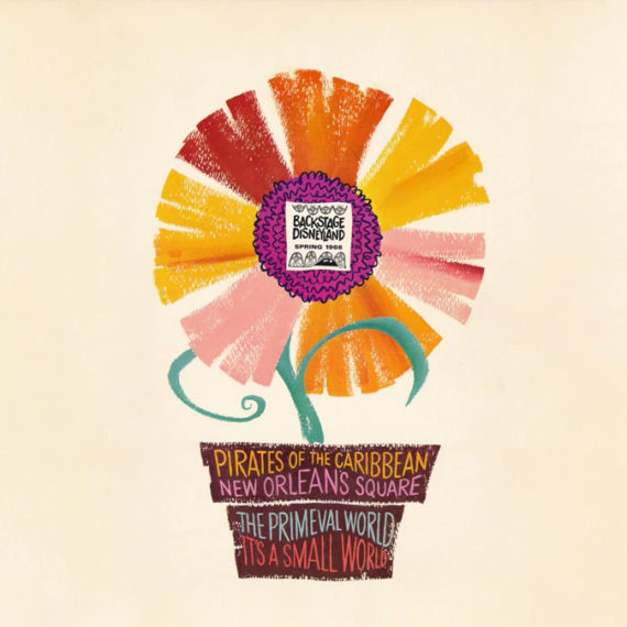
Backstage Disneyland
Cabel Sasser collected oodles of “Backstage Disneyland” newsletters distributed to Disney park employees (cast members), scanned them in (really well) and uploaded to the Internet Archive. Worth it for the covers but when you dig into each issue it is a gargantuan trove of inspiration, visually and content-wise.
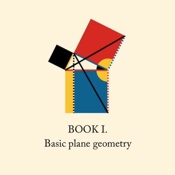
Byrne’s Euclid
Nicholas Rougeux’s (glorious) reproduction of Oliver Byrne’s celebrated work from 1847 with interactive diagrams, posters and more. / relink via (in a roundabout way) Jim Nielsen on spacial Safari and good ol’ semantic, accessible HTML
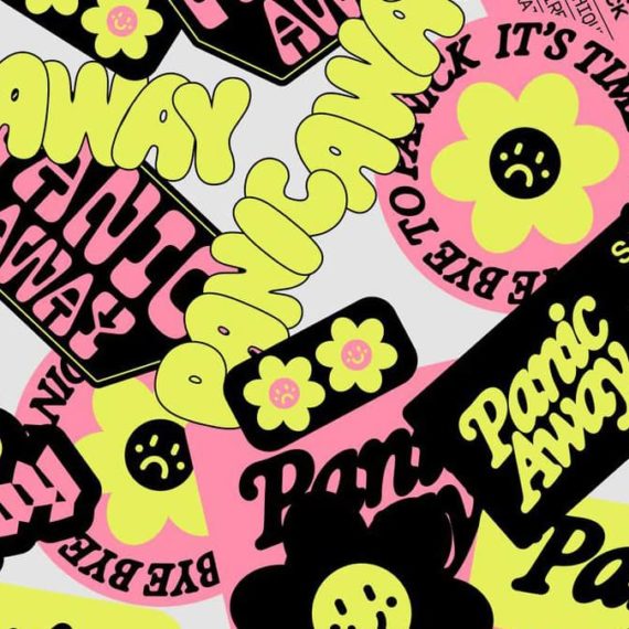
Panic Away
French illustrator and designer Justine Jossart created products featuring anxiety and phobias to sell and get rid of them for good. / via FontsInUse
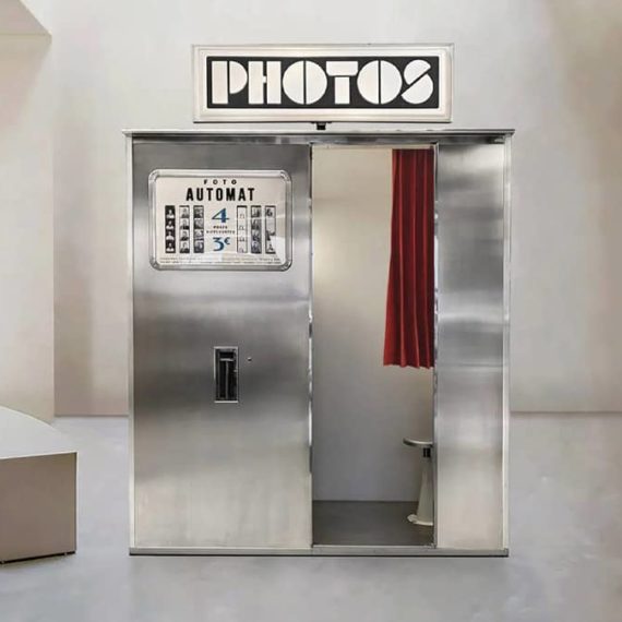
FotoAutomat
There are less than fifty working analog photo booths remaining in the world and FotoAutomat is working to restore and maintain more (and they're each restored to their delightful original design). How fun would it be to visit all of them? / via Present & Correct
Graphic Design Reading List
Dig the breadth, diversity and cross-section of websites, articles and books covering a bevy of design topics. / via DJ

Busy Beaver Button Museum
I’ve had oodles of buttons produced by Busy Beaver (they do fantastic work). I didn't realize they’ve also made a book and started a button museum. Fun. / via Grace

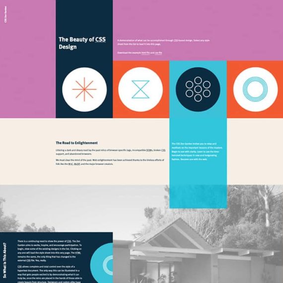
CSS Zen Garden is 20 today
Admission, I never was good at CSS. I made things with tables and visual editors. But the CSS Zen Garden taught me how to see, understand and articulate CSS. Dave Shea reflects a bit on how important it was (and still is). I'm linking to Andrew Lohman’s contribution, but really the joy is in clicking around the archives at how others re-interpret the page!
Squaring the Circle (The Story of Hipgnosis)
Hipgnosis made extremely iconic album covers. This is the trailer for a film about this art design studio. / thanks Tom!

The Federal Design Improvement Program
Phil Edwards shares history of the initiative that brought identity standards to government institutions.

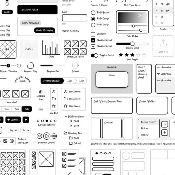
Start low-fi
Erica Heinz shares perspective on why low-fidelity is a better approach for product development. In some sense, this is a great approach for any notion...
A Mid Century
This poster from Eaton Print Shop made me chuckle. / via Chris Streger

Making an interactive blog map
Or any sort of diagram for that matter. Tom Critchlow shares an option that uses Figma, SVGs and CSS. I had no idea this was possible — this opens up so many doors!

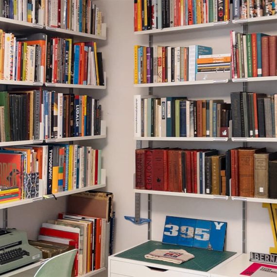
Doug Wilson catalogs his library
From the shelving, organization, labelling and cataloging — an inspiration for anyone who appreciates everything in its right place, and accessible to share.
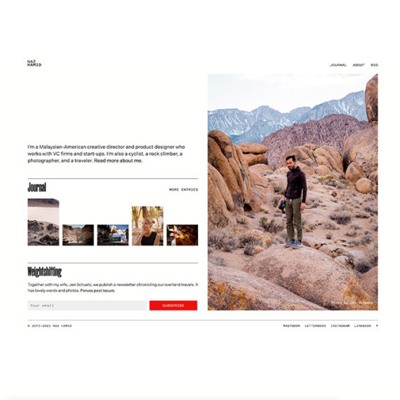
Naz Hamid’s personal website
For a long time this domain linked to other online homes for Naz. During the pandemic it started to evolve. Now it is a new destination unto itself. Thoughtful details abound.
A bearded dude in an orange hat
The Oklahoma Department of Wildlife Conservation is clapping back in support of their emblem on social media. Some chuckles in the replies / via Brand New

Designing Women
An enlightenment project exploring the impact of women in design. I particularly enjoyed all the profiles. Just digging into the resources. / via Daniel Benneworth-Gray’s Meanwhile newsletter
Jason Forrest’s career chart
Followed the path to Jason’s site from the Eames quotes and I can get lost for days on his personal site. The career chart on his about / contact page offers a snapshot of his work and passions—a lovely bit of visualization.
