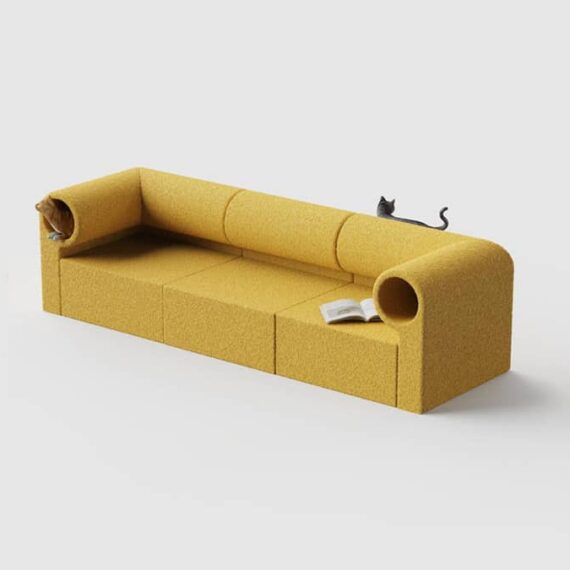
Seating with built in cat tunnel
Gasping and clutching pearls wanting this to be a real thing one could buy. / via Present & Correct
Production design of “Dune”
Kirill Grouchnikov interviews Patrice Vermette and it's a great read with wonderful bits like "Design needs to support storytelling, inform us of the past as well as the future." (more interviews here) Extra bonus: Exploring Patrice's filmography to soak in more design.

Universal Principles of Typography
Elliot Jay Stocks flips through his upcoming book with concepts, theories, and guidelines for choosing, pairing, and using type. Looks to be a wonderful addition to a design library.

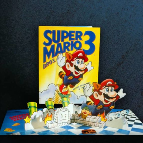
Iced Animal cookies based on a puzzle by Enzo Mari
Delicious looking and absolutely gorgeous. Swipe through to see the packaging for the 1957 puzzle. / via Present & Correct

Minx, the (not real) magazine
One of the best parts of the series Minx was the vibes — costumes, hairdos and sets were groovy — but it was when they dove into the development and design of the namesake magazine with mockups on the wall that I took notice. Turns out Pentagram was behind those spreads. Dig seeing more details. / via Michael Bierut
Make better documents
A few paragraphs into this essay about enhancing messages in documents, Anil shares an animated gif from Joey Cherdarchuk that cleans up a table of data. It is mesmerizing like those videos of volunteer lawn trimming or deep car cleaning — I could watch them for hours.

Wonder City of the World: New York City Travel Posters
March 14 - Sept 8 Poster House, wonderful museum tucked between Flatiron and Chelsea, is exhibiting travel posters (including those sweet ones from TWA). I have no doubt this will be worth the visit (or free on Fridays). / hat tip to Thor

Visit the Eames Archives
Scheduled, guided tours of the collection in Richmond, California. Bucketlited / via Scott Boms’ Through Lines
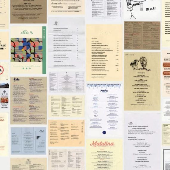
NY Times on menu design trends
Dig everything about this sort of reporting. Now make a pretty list of all Biden’s accomplishments NY Times! (gift link)
Jim Nielsen’s icon galleries
Jim has been designing, developing, and curating icon gallery sites for iOS, macOS and watchOS since 2011. They are incredible in every way to search, sort, browse and enjoy. He also helped with the most excellent App Icon Book by Michael Flarup and team. So. Good.
Patrick’s picks for best album art of 2023
He does this every year and I always find not just new music to explore, but wonderful art. (He also creates a list for worst album art of the year)

Aqua Interface
Been digging into the world of Mac OS X Aqua for icon inspiration. After revisiting the overview on Wikipedia I’m pretty sure the Leopard release was my favorite visually (soft gray gradient instead of pinstripes or brushed metal). The original Human Interface Guidelines had some nice tips “For great-looking Aqua icons, have a professional graphic designer create them.”

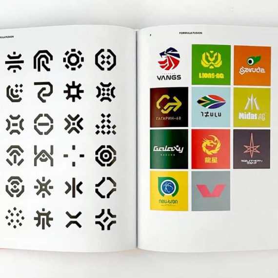
A to Z of The Designers Republic
My first exposure to TDR was likely the Wipeout games on PlayStation. It was an entirely new world of graphic design in motion. / via Marmite Defontes
Keith Cottingham’s logos and icons for Apple’s hardware and software
He just has a few examples presented on his site, but goodness how I loved these (and still do!) / via Arun Venkatesan
Brand bentos
Browse identity mood boards packed up in delicious snack sized boxes. / via OMGLORD
More work by Girvin, this time for video games
The group behind those iconic film logos were also behind the packaging for Nintendo of America. The design language across the NES, Gameboy, SNES and the games themselves was very likely one of the first design systems I’ve experienced. Oodles of insight about the work on their blog post Designing Game Worlds.
Motion picture title design by Tim Girvin’s studio
So many of these are etched into my brain. It’s nice to connect the work with a studio. / with a tip of the hat to Brandon Schaefer’s blog filled with quotes and other bits of inspiration.


Cy Biopharma identity and packaging
Swiss company producing psychedelics for chronic pain gets a brand that mixes “mystical with the scientific” by Play Studio. It’s nice to see the grids and use of a favorite typeface, Univers. / via BrandNew

An interview with Tobias Rylander, designer behind The 1975’s house set
I was lucky to catch The 1975 “At Their Very Best” tour and the set was so refreshingly different and awesome. It really felt like a theatrical production or watching a sitcom being filmed live.

A Riso-printing primer
Why yes, I have wanted to learn more about Riso printing. This link found along with more from Scott Bom’s Through Lines 169.

Ellen Voorheis
Enjoyed wandering through Ellen’s work (and this collaboration with Saft Rodeo). Brightened up a lovely rainy morning. / via New Commute
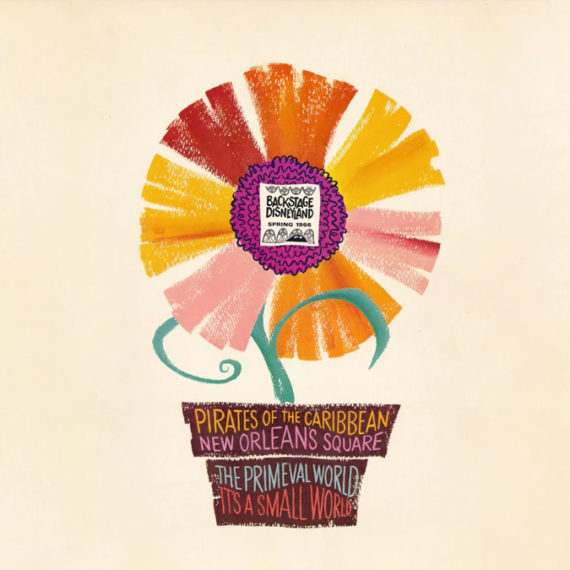
Backstage Disneyland
Cabel Sasser collected oodles of “Backstage Disneyland” newsletters distributed to Disney park employees (cast members), scanned them in (really well) and uploaded to the Internet Archive. Worth it for the covers but when you dig into each issue it is a gargantuan trove of inspiration, visually and content-wise.
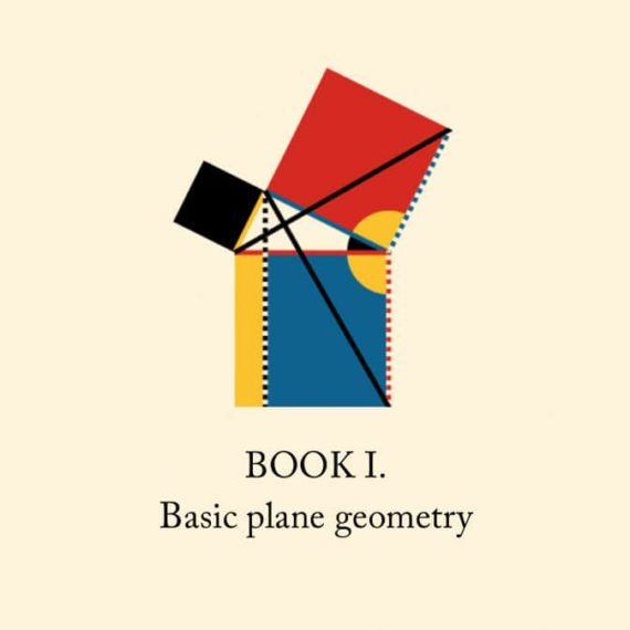
Byrne’s Euclid
Nicholas Rougeux’s (glorious) reproduction of Oliver Byrne’s celebrated work from 1847 with interactive diagrams, posters and more. / relink via (in a roundabout way) Jim Nielsen on spacial Safari and good ol’ semantic, accessible HTML
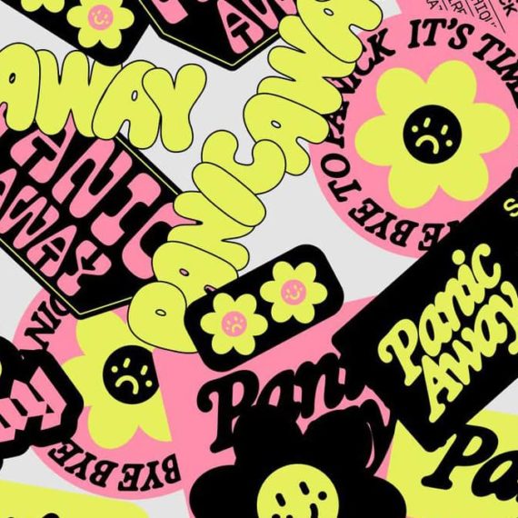
Panic Away
French illustrator and designer Justine Jossart created products featuring anxiety and phobias to sell and get rid of them for good. / via FontsInUse
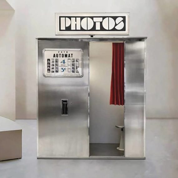
FotoAutomat
There are less than fifty working analog photo booths remaining in the world and FotoAutomat is working to restore and maintain more (and they're each restored to their delightful original design). How fun would it be to visit all of them? / via Present & Correct
Graphic Design Reading List
Dig the breadth, diversity and cross-section of websites, articles and books covering a bevy of design topics. / via DJ

Busy Beaver Button Museum
I’ve had oodles of buttons produced by Busy Beaver (they do fantastic work). I didn't realize they’ve also made a book and started a button museum. Fun. / via Grace

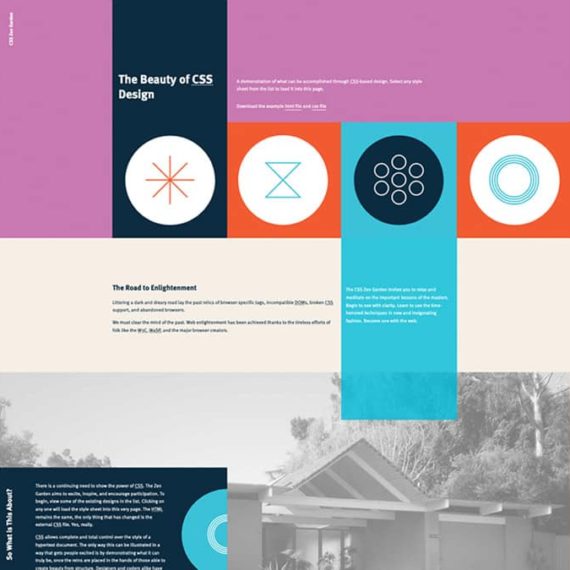
CSS Zen Garden is 20 today
Admission, I never was good at CSS. I made things with tables and visual editors. But the CSS Zen Garden taught me how to see, understand and articulate CSS. Dave Shea reflects a bit on how important it was (and still is). I'm linking to Andrew Lohman’s contribution, but really the joy is in clicking around the archives at how others re-interpret the page!
Squaring the Circle (The Story of Hipgnosis)
Hipgnosis made extremely iconic album covers. This is the trailer for a film about this art design studio. / thanks Tom!

The Federal Design Improvement Program
Phil Edwards shares history of the initiative that brought identity standards to government institutions.

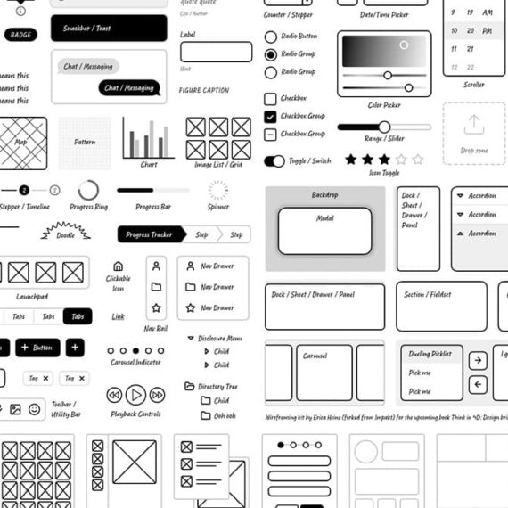
Start low-fi
Erica Heinz shares perspective on why low-fidelity is a better approach for product development. In some sense, this is a great approach for any notion...
A Mid Century
This poster from Eaton Print Shop made me chuckle. / via Chris Streger

Making an interactive blog map
Or any sort of diagram for that matter. Tom Critchlow shares an option that uses Figma, SVGs and CSS. I had no idea this was possible — this opens up so many doors!

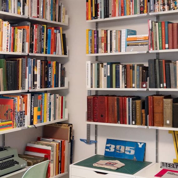
Doug Wilson catalogs his library
From the shelving, organization, labelling and cataloging — an inspiration for anyone who appreciates everything in its right place, and accessible to share.
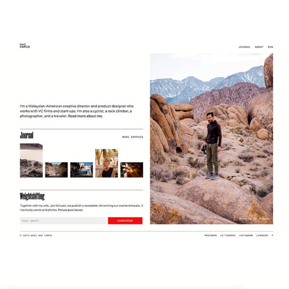
Naz Hamid’s personal website
For a long time this domain linked to other online homes for Naz. During the pandemic it started to evolve. Now it is a new destination unto itself. Thoughtful details abound.
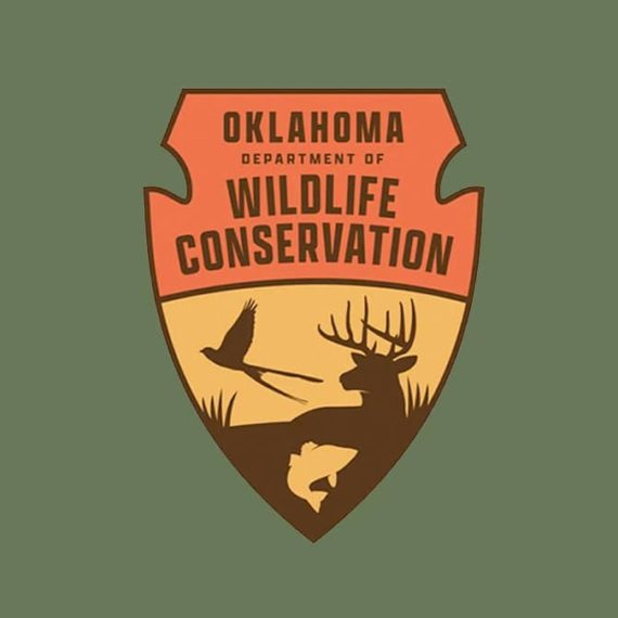
A bearded dude in an orange hat
The Oklahoma Department of Wildlife Conservation is clapping back in support of their emblem on social media. Some chuckles in the replies / via Brand New
Designing Women
An enlightenment project exploring the impact of women in design. I particularly enjoyed all the profiles. Just digging into the resources. / via Daniel Benneworth-Gray’s Meanwhile newsletter
Jason Forrest’s career chart
Followed the path to Jason’s site from the Eames quotes and I can get lost for days on his personal site. The career chart on his about / contact page offers a snapshot of his work and passions—a lovely bit of visualization.

Charles Eames on design
“Design as a plan for arranging elements to accomplish a particular purpose.” Jason Forrest calls out a few other choice tidbits from this Design Q&A video with Eames. / via DJ

Valentine Moon Pie packaging
I dig that the box for these can be cut up into 10 individual Valentine cards. / via Brand New’s Friday Likes

The 2023 Type Trends Report by Monotype
There are waves of vibe that crash into our visual shores through type. Monotype always collects keen perspectives for a surf report. / via Brand New

Unsung Heroes
Here’s a great place to dive into Scott Bom’s personal website that has the best buckets of navigation and a fresh coat of paint. Be sure to delve into Documenting for a stream of inspiration and type releases. (But all sections are filled with goodness)

Smith & Diction’s Pitch Deck
All wrapped up nicely in a Figma presentation with tangent links to moodboards and samples.
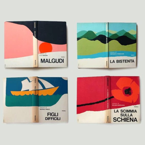
Book covers by Pino Tovaglia, mid 1970s
I'm in dire need of a large stack of colored paper. / via a Present & Correct tweet
A deep dive into the RIDGE wine label
I've always loved these labels, with their understated design and use of Optima. Nice to learn the backstory and understand the system in place.

An interview with Geoff McFetridge about the interfaces in “Her” and then some
Seems like a good time to re-watch “Her.” Though the movie is almost 10 years old, its view of AI and interfaces is quite prescient. Scene: Firing up the OS for the first time.
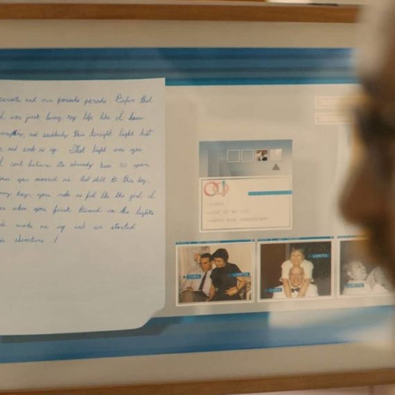
More images of the interfaces in “Her”
Including a really nice sketch

I want to go to Sweden and have some fries
And a burger. Delighted by this identity by Kurppa Hosk. Also, I want to play Wipeout again. / via Brand New

Design System Advent Calendar
I trust whatever insight Dan Mall shares about Design Systems will be actionable and extremely valuable. (I also dig this format as it seems like it won’t be overwhelming!)

Kazam Magazine
Speaking the Eames Institute, they have a (virtual) magazine to share stories about people, projects, and ideas that are shaping a better tomorrow. I kinda wish it was a real magazine, had an RSS feed or both!

Why Japan’s internet looks very different
This video by Sabrina Cruz is dense and mind-blowing from multiple angles. (I've been working on Japanese websites of late.) As Andy Baio notes, the addendum is well worth a visit.

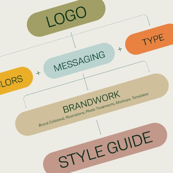
Just say no to logo
An appeal for a better design vocabulary from a favorite professor from OSU, Paul Nini. Get to know the difference between a logo, brandmark and then some. / Thanks DJ!

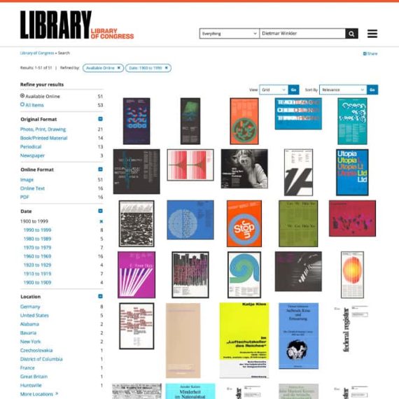
The Library of Congress: Dietmar Winkler
Reminding myself of the trove that is the Library of Congress site, thanks to Antonio of AisleOne.

Lotte Chair by Sarah Hossli
Simple design to help folks get in and out of the chair. / via Dezeen

The new Verge
I quite like how the new Verge logo overlaps and intersects featured images. Their refreshed design and intent is described in this post. Not sure about the commingling Tweets and articles, but I applaud experimenting.

Paul Rand’s Logo Presentation Books
A trove of logo concept books from Rand. Many of these identity studies weren't approved. Still great to peruse.
The beautiful signage of Comédie-Française
Theater wayfinding inspired by pulleys and ropes which are used to change sets on stage. More photos on CL Design's site

Visions Not Previously Seen
Barbara “Bobbie” Stauffacher Solomon mixed Swiss graphic design principles with West Coast Pop art stylings, essentially creating supergraphics, and in doing so shaped the history of design. / Revisiting this link for inspiration