How to Design Better Icons
Great short introduction to some of the basics when developing a family of icons
Ink traps explained
Extremely well deep dive into ink traps and all the variations. Get to the bottom for the kicker of the Imperial Trap. / via Under Consideration

Group X branding
An anonymous group of artists and curators making things happen in Philly. Now with a fine identity to mask their identity. Always solid seeing what Smith & Diction make. / via Under Consideration

An Illustrated Catalog of American Fruits & Nuts
Assembled between 1886 and 1942, a collection of watercolor fruits and plants made by 21 artists. (This book looks beautiful.)

Ui/Ux et al
"Think. Consider. Sketch. Think again. And look around you. It’s all been done before, albeit with different code." - Erik Spiekerman's thoughts on digital vs. traditional design.

What is Figma
I'm just going to send folks to this intro video by Tori Hinn and Enle Li when trying to extoll the awesomeness of this collaborative design application

This way. Guide
Type specimen guide focused on arrows and stories behind navigation tools that we use every day.

Found some vintage AppleLink-era icon studies.
- Susan Kare, on Twitter
15 women who have made lasting contributions to design
Great list with some names new to me. Particularly, now I know who did the Lovesexy type and Paisley Park logo, Margo Chase.

Gergely Gizella’s personal website
Is unlike any I have experienced. / via Belong.io

Making accessibility a feature, not a fix.
Thanks to Kay I've begun to understand the implications of accessibility. And Greg has a great summation of work by Stephanie Hagadorn and her team at Indeed to incorporate the thinking into the process of design.

Plus Equals
A quarterly zine in which Rob Weychert explores algorithmic art with a focus on combinatorics.

The Society for News Design Best of Awards
Gold awards for visual storytelling that defines the state of the art in digital design. Some excellent nuggets buried in the database. / via Greg Storey

Simplify your tech diagrams
Layercakes (a new term to me) should simplify, not overcomplicate. Stop filling your tech diagrams with TMI. An essay by Paul Ford

Bad Feeling
Editorial project fetching entries from online forums related to emotional and psychological struggles. / via Fonts in Use

Japan Pictograms
Nippon Design Center released a set of pictograms to support tourism in Japan, and they're lovely. / via Under Consideration

So who drew that Fender logo…
OH no Type Co gets to the bottom of it 3 years after asking...

Canada Modern
A (gorgeous) physical and digital archive of Canadian graphic design. / via UnderConsideration

I Miss My Bar
Adjust the ambiance and pour yourself something fizzy. A lovely site by Lagom + Tandem that might be offline because it's getting hammered. Pardon the pun.

Electronic Plastic Visual Database
Jaro Gielens collection of 900+ electronic games that are searchable by color, brand and then some. Wowsers! / via Swiss-Miss

Mille Bornes design through the years
I was adding a favorite and Thor sent me this link and I thought it looked familiar. A great look through the history of card design for this game.

San Francisco Symphony rebrand
By Collins. Agreeing with other folks that think this is lovely.

Ram’s Palettes
Colours taken from Dieter Rams legendary production collection for Braun. Made by Chad Ashley. / via Paul Bausch

12 Legendary BMWs
I'm mostly here for the graphic illustrations / via AirBag

That new Tesla steering… yoke

Getting lost while creating wayfinding

Block Studio

Wakamai Fondue
The tool that answers the question “what can my font do?” This is an excellent tool / via Doug Wilson

Nix & Kix

366 Cans Challenge by Studio Blackthorns

Remote Work for Design Teams

Original Pattern Brewing Company

Esquire magazine, September and October/November 2020

World Chess – Official FIDE Gaming Platform

The three-click rule is dead.

Chris Davies’ Middle Eastern Kitchen brand work

Ethan Marcotte’s design systems reading list
Been thinking about systems these days. This list is handy.

1972 U.S. election, CBS News

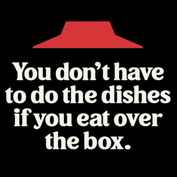
Simon Walker’s Pizza Hut Font

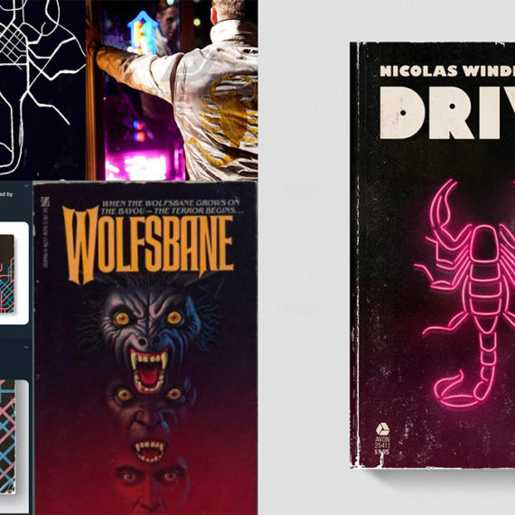
Good Movies as Old Books / 02: The Hard Way

Vern Ho’s home office

Philographics: Big Ideas in Simple Shapes

Tokyo Camouflage

Pearlfisher ‘s Design, Packaging & Branding of E-Cloth

Type Scale – A Visual Calculator

The typographic scale

The Typecraft Initative

The Young Jerks have a new website

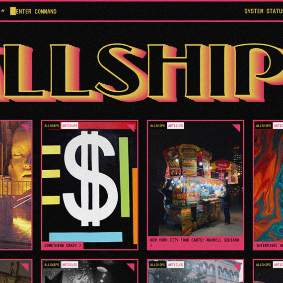
ALLSHIPS | A Creative Community

How social justice slideshows made by activists took over Instagram

Standards

Netlify Reaches One Million Devs

A thread about the life and wisdom of Kenji Ekuan, designer of the Kikkoman soy sauce bottle.

Brad Frost, Atomic Design

Lo Siento Studio
Dig the work of this studio / via @manfredhwf

Hi, welcome to Crossroads. We’re beer!


