
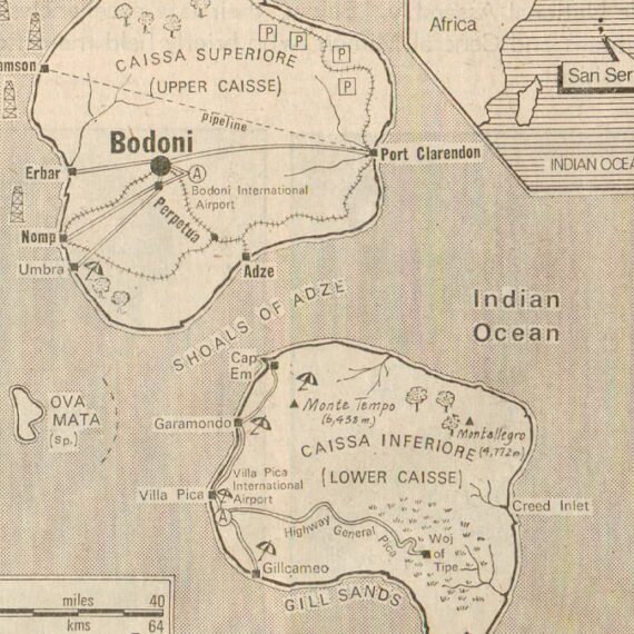
The Beautiful Islands of San Serriffe
Doug Wilson dove deep on an elaborate April Fool's bit in The Guardian that involved a series of islands with typographic inspiration. Even the ads were in on the joke.
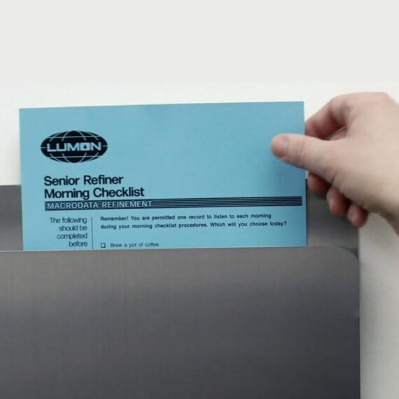
Typography in Severance
I was looking for a font to use for a placard and stumbled on this wiki chock full of Severance tidbits. Extra appreciation for screen grabs of employee manual, forms and assessment file.
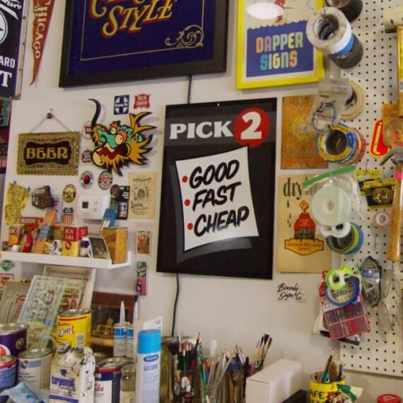
The Chicago Look
Field Notes' Spring 2025 edition is a beauty, as is the accompanying film that provides history of the sign painting techniques that inspired it.

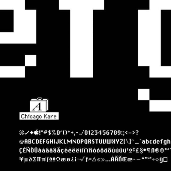
Chicago Kare by Duane King
Just what it says on the box: A Faithful Reproduction of the Bitmap Version of the Chicago Typeface Created by Susan Kare for Apple Computer in 1984.
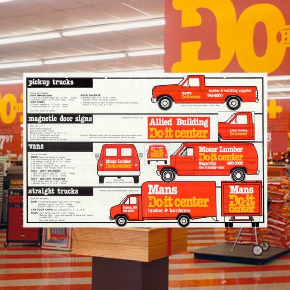
Do it Center identity (1980)
As Ryan Brotherston notes in this Fonts In Use post, Do it Center used "a copious amount of tightly-kerned ITC American Typewriter Condensed Bold" to great effect, thanks to Don Watt + Associates. I always loved going in these stores with my dad. I think this identity is probably one of the major reasons why.
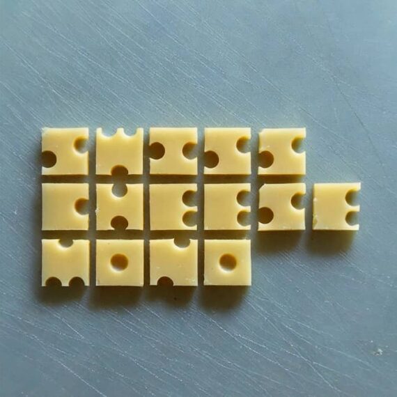
Swiss Cheese Mono
Rob Meyerson made a chunky sans monospaced display font that looks quite tasty.
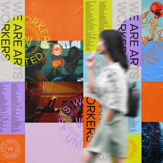
Fonts in Use: Arts Workers United
Digging the custom typographic ligatures One Design Company created for this arts org brand and also very much dig the mission of Arts Workers United
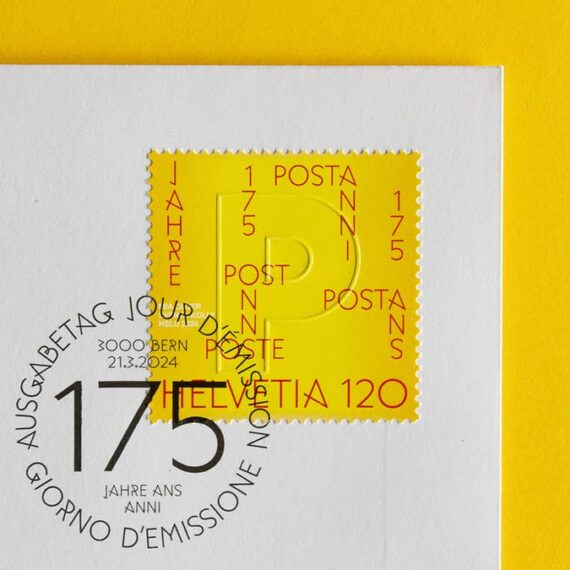
Swiss Post 175th Anniversary stamps
I don't collect stamps but buy sheets of the ones I like and eventually use them when sending out good (non-bill) mail. That said, I'd totally buy some of these Swiss Post ones to frame because they're not valid here. In hindsight, I should frame sheets of the US stamps too.
Type Design Like It’s 1987
A live demo by Mark Simonson of early font editors on a Macintosh Plus. The sort of cozy I like to feed algorithms to soothe my soul and prevent me from buying old computers on eBay. / via Luke Dorny

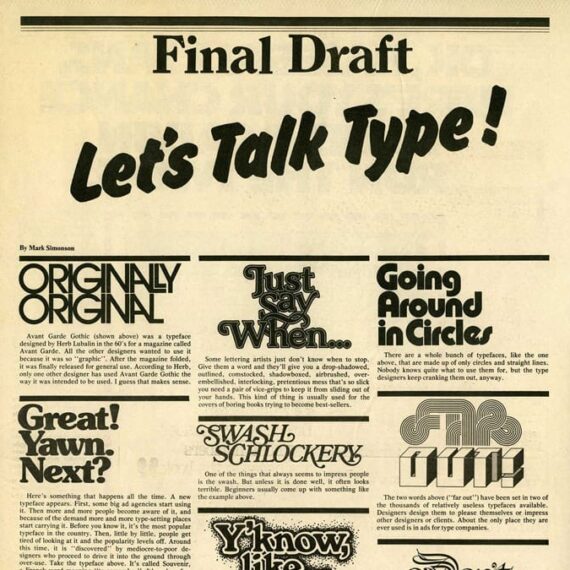
Mark Simonson: Let’s Talk Type!
I didn't realize my standard reply in design conversations (in partial jest) came from this piece: Set everything in Helvetica "flush left, ragged right": don't center anything; make sure everything lines up with something else and leave plenty of creative "white space." / via Cameron Moll back in 2006
50 Years of SNL’s Graphic Parodies
Steven Heller chats with Marlene Weisman, an in-house designer at SNL (1988–1994) — a time period that spanned pre-computer to having a "computer room." / via this MetaFilter post where I left the comment "Dream job" because of course it would be!
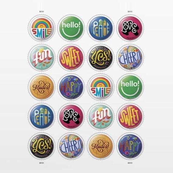
Pinback Button Stamps
Oh goodness. These stamps by Greg Breeding are delightful snippets of type, design and vibe. More about the set in this video. Extra bonus? They made a set of pins to boot. (thanks Grace!)
Amos Paul Kennedy, Jr
On the second roll of Greg's dice you'll find a link to a monograph with the story and work of Amos and another link to a documentary. I've never known of this man previously and I feel better for having this omission corrected. Powerfully good messages delivered beautifully.

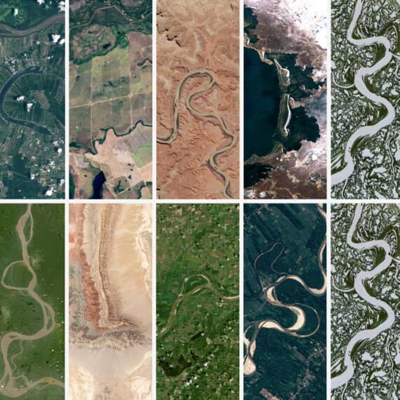
Land satellite type
It's the little things. This one offers a nice way to navigate our planet. Type in a word or name to see it spelled out in Landsat imagery of Earth / via Hiro
Departure Mono
"A monospaced pixel font with a lo-fi technical vibe" by Helena Zhang (and help from Tobias Fried) with bonus breakout game at the bottom of the type samples. Lovely (as is Helena's personal site) / via Robin Rendle

In defense of an old pixel
Marcin Wichary talks about pixel fonts and boy howdy, his enthusiasm, thoroughness and technical wizardry merit a standing ovation. Bonus: Design Your Own Pixel Font (in browser) / via Scott Boms
Tiny Grotesk
I'm particularly smitten with the wide uppercase G of this type superfamily by Robin Mientjes of Tiny Type Co., but I love the texture of the whole lot. Some additional design notes for further reading on approach.

High-Legibility Alternates
I didn't realize high-legibility alternates in Apple's default San Francisco typeface can be turned on and off with CSS. And on that note, I really need to look for a nice serif anyway.

Marcin Wichary highlights 4 books about type that just came out
With several on the thread new to me, and they all look gorgeous.

Universal Principles of Typography
Elliot Jay Stocks flips through his upcoming book with concepts, theories, and guidelines for choosing, pairing, and using type. Looks to be a wonderful addition to a design library.

Ease
Superfun sans family with oodles of weights and round varaints. The web page showing it all off is icing on the cake of visual delight. Designed by Felix Pfäffli and Robin Eberwein.

Bricolage Grotesque
Dig this "open source variable font with French attitude and British mannerisms" from Mathieu Triay (behind the also awesome Marvin Visions) / via Kay

The Process of Forevs
The latest lovely font from Oh No Type Co. Love seeing the process of creation in this blog post. The typeface has so many stylistic alternatives.

Typeset in the Future
A collection of visual essays exploring type in sci-fi films (it's probably Eurostile) by Dave Addey. He dives deep and shares receipts. Also available in book form. / via Yewknee

Rukh typeface
Sometimes you see type and just want to make some designs. This is one of those typefaces. Lovely work by Mohammed Samad and Bouk Ra.

Bury Me in the Highlands
Let's say you make sourdough and give the loaves away but wanted to put them in a bag with a stamp and your brother was a type designer... (Swipe to see said stamp in context). Gorgeous.

Very Robin
Robin Mientjes has a new website and it is delightful.

BLAG’s top articles from 2023
I recently subscribed to BLAG’s print mag and it is a beauty to hold. Here’s a sampling of things they share. So much to savor!

Learn to Make Your First Custom Font
Dan Cederholm is hosting a workshop to show how it's done. I've not had an idea for a font, but I've kind of always wanted to make one.

Ozik Soft
Erik Marinovich has added another goodie to Nuform, a variant on one of their first releases that considers the softer side of Sears. Complete with the fun ovoid counters of Ozik, but without the edges.

Wilco Loft Sans
Typeface by SimpleBits for the band Wilco, inspired by a "GUITAR" sign hanging in their recording studio. With weights that span Treble, Mid Range, Low End and Bass.

Motion picture title design by Tim Girvin’s studio
So many of these are etched into my brain. It’s nice to connect the work with a studio. / with a tip of the hat to Brandon Schaefer’s blog filled with quotes and other bits of inspiration.

Mystique Astrology kit by Mattel
Far out 70's psychedelic cartoon vibes on this binder filled with astrological charts and wheels and man I dig it.

A Riso-printing primer
Why yes, I have wanted to learn more about Riso printing. This link found along with more from Scott Bom’s Through Lines 169.

BlockFace – A Stamp Kit to Explore Typography
Another fine Kickstarter project by Martin Schneider bringing Will Mower’s type to many. This set of geometric stamps can form all sorts of letters and whatnot.

Type Revival for Film & TV
Leah Spencer with some wonderful behind the scenes from the art department for film & TV. A healthy bit of process and examples from The Marvelous Mrs. Maisel whet the appetite for a smorgasbord of additional goodness on Alphabettes / via Robin Rendle

The Magic of Mr Masking
Superdig this approach to type by Gerardo Picado

Kern Type
A letter spacing game that’s quite the challenge. Mark MacKay also has made a few more games that teach design concepts. / via Tom Scott

Aptos, the new Microsoft default font
For 15 years it has been Calibri, a thoroughly uncomfortable san-serif. Aptos looks much nicer and is quite robust. / s’more insight on The Verge

Letterform Archive shares gems, like these numbers
Verdun Cook, U&lc, vol. 2, no. 1, The International Typeface Corporation, New York, 1975

There’s always new ways to expand the scope of our care
Robin Rendle on updating and maintaining a personal website and considering the details, like type, but also just all the things.

Linotype Book Project
Doug Wilson is expanding his interest and knowledge of Linotype into a book. If it is anything like the film he was a part of it’ll be excellent.

Pull quotes by Jonathan Hoefler
Inspiration and nice type make a good marriage. / via a reply to Merlin’s Wisdom Limo

Regrets
If you follow OH no Type Co’s (excellent) Instagram or TikTok you’d know this nouveau display typeface was coming. It has flowers (and a monstera) in the ornaments.

Simple Type Co.
Dan Cederholm launched a new site that brought together his fonts and goods. He keeps adding to it with updates, samples and enthusiasm.

MonoLisa monospace font
Designed to ease staring at it for long stretches of time with bonus script (fancy italic) version / via Trevor Morris

Casserole
OHno Type Co’s revival of Davida is joyous.

The 2023 Type Trends Report by Monotype
There are waves of vibe that crash into our visual shores through type. Monotype always collects keen perspectives for a surf report. / via Brand New

OH no Type Co Reels
James Edmondson makes learning about typography superdooper fun. I've been learning lots about type history and usage from his reels. (Ugh. Instagram. But still!)

Fontshare
Indian Type Foundry’s growing collection of professional grade fonts that are 100% free for personal and commercial use.

A deep dive into the RIDGE wine label
I've always loved these labels, with their understated design and use of Optima. Nice to learn the backstory and understand the system in place.

Linotype & Machinery
Doug Wilson toured the British Linotype factory to see what remains. He brought together history and oodles of photos in his post.

The Future Belongs To What Was As Much As What Is
Colorful typo/graphic gatehouse installation by Morag Myerscough and poet Ellen Moran in northern England

The expanded San Francisco font family
The base type for Apple OS gets more expressive style widths with a great overview of how and why to use each. / via Merlin who says "This man has amazing hair"


Aaron Draplin Wake & Make Challenge
Closed out a day of computers & zooms & needed to do something & didn't want to think about it. This 5 minute type drawing exercise from Draplin hit the spot. (The thing I made isn't very good.)

2022 Brand New Conference
Mesmerized by the dynamic type. The introduction of variables to typography is opening up some many wonderful doors. But this? This is a Whole. 'Nother. Level. More details about the identity.

The Star Wars
Diggin that hand drawn Lucasfilm logo
