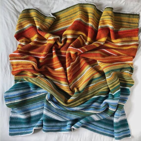
Temperature Blanket
My friend Joe just stopped by and we were chatting about data painting and he mentioned temperature blankets. I'd never heard of these before but the premise is simple and the results lovely: Crochet a blanket using yarn colors based on temperatures, one (or two rows) per day.
Day to day aspirations
While exploring eva's garden, I wandered down the path to this collection of activity trackers. Filing under dataviz
Minding the gaps
New page alert. I've added a place to track all the missing months of photos on my journal. Sometimes when I'm between gigs or feeling mindless, I fill in some of these gaps.
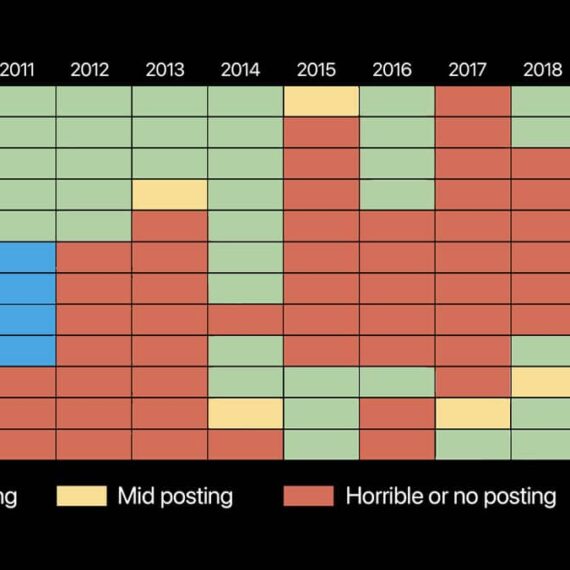
Jason Forrest’s career chart
Followed the path to Jason’s site from the Eames quotes and I can get lost for days on his personal site. The career chart on his about / contact page offers a snapshot of his work and passions—a lovely bit of visualization.

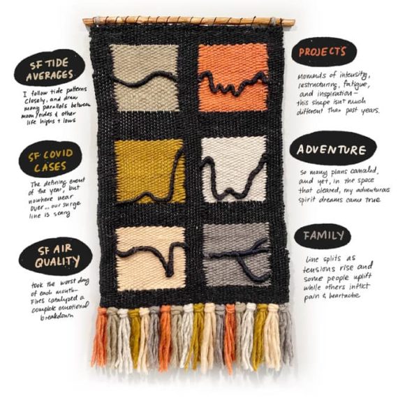
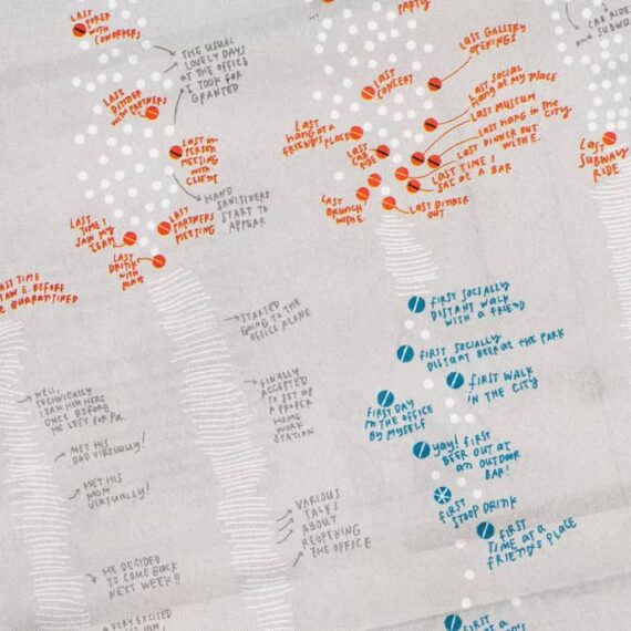
Catherine Madden’s woven tapestry
This journey map captures a year of highs and lows in 2020, part of a workshop with Eugene Eric Kim.
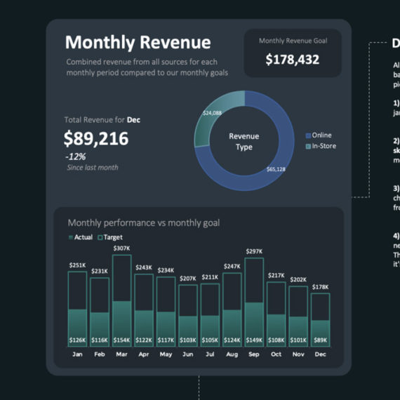
Excel, an overlooked design tool
I've done a pretty good job of making Powerpoint look good, but this is next level stuff. / via Sidebar
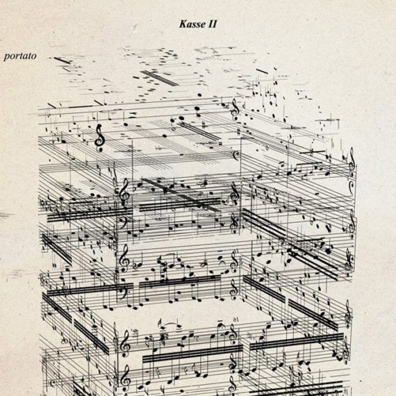
Gyorgy Ligeti’s Artikulation visualized by Rainer Wehinger
Donald Craig scanned the pages of visualization from the 70's and synchronized them with the music. / via @pixlpa

A great thread about music visualization
Sometimes Twitter's algorithm reveals good things. Like these tweets from Andrew Benson and the replies.
Outside the box
An example of visualization through code (Be sure to click out and see more work by Mathew Aldred) / via DJ

‘My 2020 in Data (So Far)’
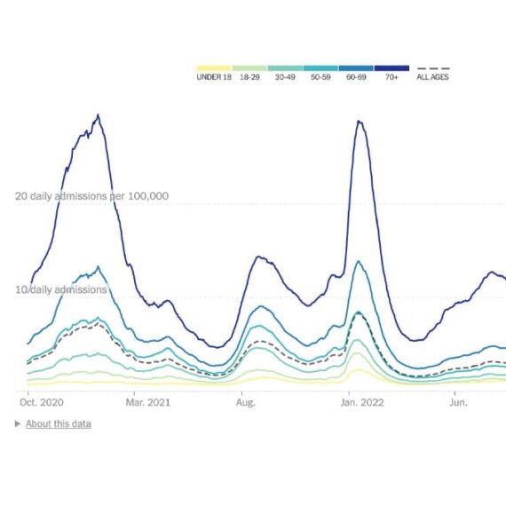
Coronavirus in the U.S.: Latest Map and Case Count
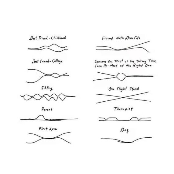
“Closeness Lines”: Lovely Visualizations of Relationships Over Time

5+ Neat Data Visualization Projects from 2008
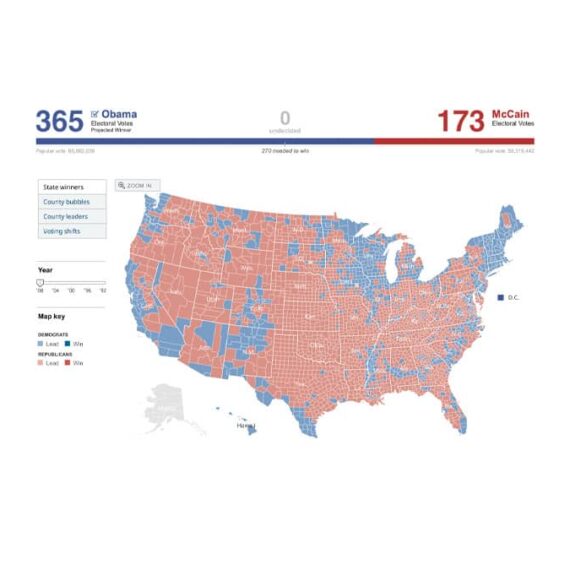
President Map – Election Results 2008 – The New York Times
Entries for a Personal Visualization Project
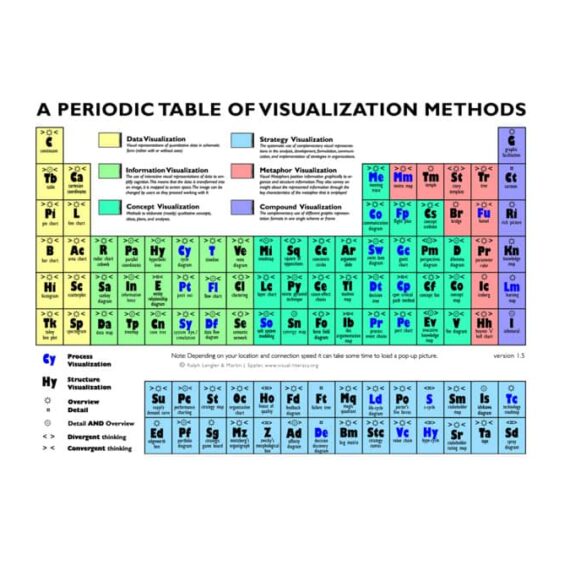
A Periodic Table of Visualization Methods
Information Aesthetics
A blog for creative information visualization