In my early years of photo journaling I used a wide 12:5 ratio for images with the enormous resolution of 600×250 pixels (examples). I mostly did that because displays were 640×480 and I wanted a bit of image, title and text visible on screen “above the fold” and still have room for scroll bars and whatnot.
As screens got larger I retired the format because it was difficult. Now I vacillate willy-nilly to suit each image.
But lately I’ve been sticking with a 16:9 ratio for no good reason. In fact, it’s the opposite direction that screens are moving as most folks access the internet on their mobile devices.
This vexes me / feels like an opportunity. One idea is to play around with images in a tall format. So I fired up a profile on PixelFed to explore this idea (and the platform currently free from leadership with bad ideologies).
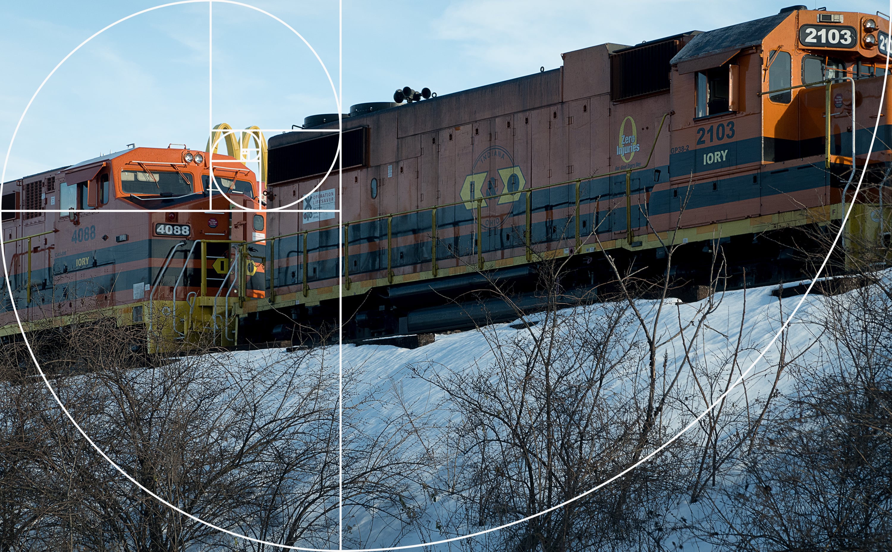
Maybe I should just use the golden ratio and call it a day.
Update: Just read Instgram updated user profile grid aspect ratios from the classic 1:1 square layout to a tall 4:5 version this week. (Shrug)