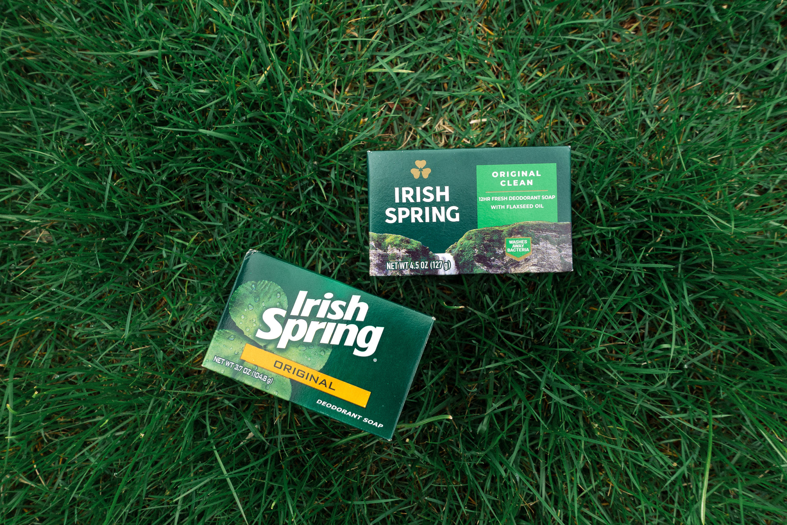
I buy bar soap because it creates less waste, generally Irish Spring because it smells nice.
They just updated their logo and packaging. My opinion would be best expressed with a shrug. Reading more about the redesign didn’t move the needle. Something something “stylish, modern masculinity.”
There was a Super Bowl commercial to get the new look out there and I vaguely remember the weirdness.
I think they should’ve just mined their 70’s commercials where they sliced into the soap and then cut to a shower scene.


