This is staged. Usually there are drying dishes on the counter and pots piled in the sink. I also gave the backsplash a good scrubbing and added more colorful water bottles to the windowsill.
THIS IS A MEMO
This page is to display variables for type, images and galleries available in this website theme.
It’s a custom joint dreamt up years ago that came to life thanks Kay Belardinelli. Launching in 2021, we’ve become collaborators when it comes to adding features (which keeps happening as it’s a work in progress!)
The theme integrates the WordPress block editor, also always evolving. These blocks allow for different media and patterns to be used in a post or page.
Typography
Heading 1: Those water bottles are from Blenko
Heading 2: They come in lots of colors
Heading 3: Mom collected them
Heading 4: She loved teal and purple
Heading 5: My favorite colors are green, brown & orange
Heading 6: There is rhubarb hand soap by the faucet
—
Font Sizes
Tiny paragraph text
Small paragraph text
Base paragraph test
Normal paragraph text
Medium paragraph text
Large paragraph text
Extra Large paragraph text
Huge paragraph text
Gigantic paragraph text
—
Plus we have alternate versions for two headings. (Used for column headers, meta data or visual texture.)
Heading 2 ALTERNATE: THey’re all caps
Heading 3 ALTERNATE: With spacing between letters
—
This is paragraph text — nothing too fancy. The font is currently set to system default so on a modern Macintosh that’s going to be San Francisco, Windows is probably Segoe and Linux might use Noto Sans.
For the most recent site update I thought it might be helpful to remove custom typefaces to focus on structure.
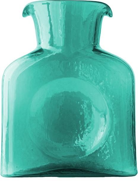
Back to Blenko water bottles, I mentioned they’re available in lots of colors. If I had to give three bullet points about these vessels:
- They make a great vase for flowers
- Also work for serving water if you want to fancy up a moment
- They’re hard to clean without a scrubber thingy because of the narrow neck
If I had to make a numbered list, I’d say these are among my absolute favorite things about Blenko:
- All the colors!
- They’re based in West Virginia
- Everything is made by hand so two pieces are the same
All these lists might want a bit of indention on the left to break things up a bit!. I think I originally eschewed such spacing for no good reason.
Unrelated to Blenko but related to dishes… I was washing some by hand the other day and Casey asked, and I quote:
Why do you wash dishes by hand when we have a dishwasher right there?
Casey
I didn’t have a good answer for him then and I still don’t. Honestly it’s complicated. If it’s a “special mug” — one with printing, like this one with Loretta Lynn — I am totally going to wash that by hand, along with regular sized spoons because we don’t have enough.
As quotes go that one is pretty short, here’s a longer one:
No, we don’t need more sleep. It’s our souls that are tired, not our bodies. We need nature. We need magic. We need adventure. We need freedom. We need truth. We need stillness. We don’t need more sleep, we need to wake up and live.
Brooke Hampton
That would look nicer in a color, a serif typeface, italicized, larger or all of the above. I mean, look how nice Scott Boms treats quotations.
Let’s look at some images!
Image Sizing: There are three widths to choose from: Full, Wide and Default (or none). Let’s work our way up with the samples below. (Also? This paragraph has a custom color applied to it for a little pop! The color uses transparency so it works in dark mode.)
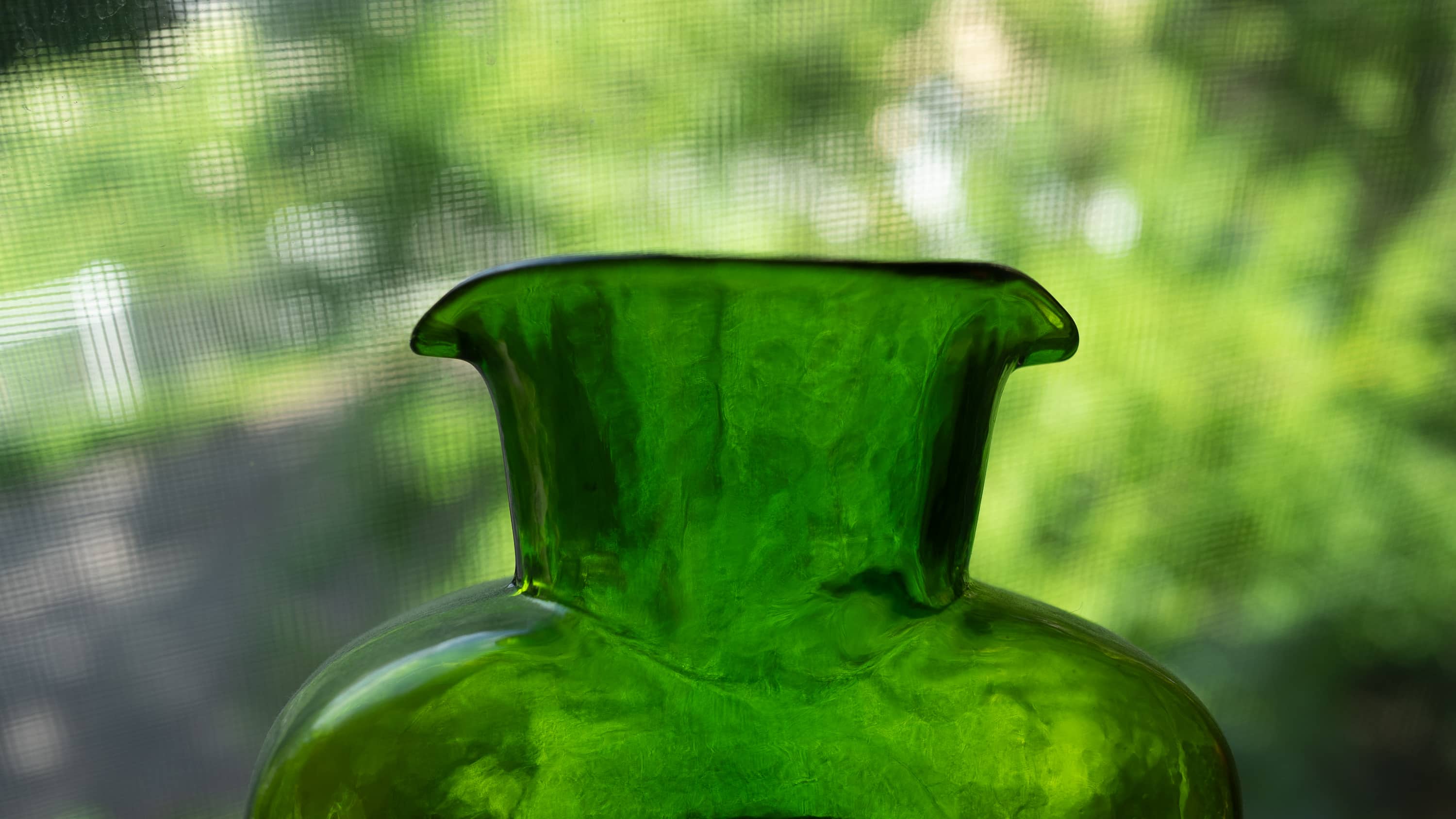
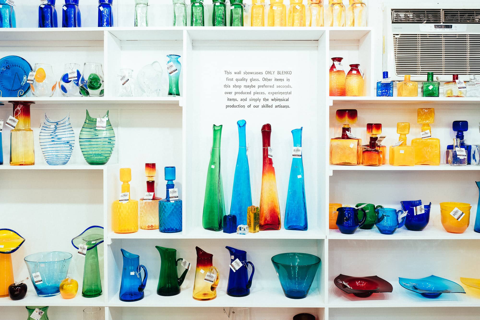
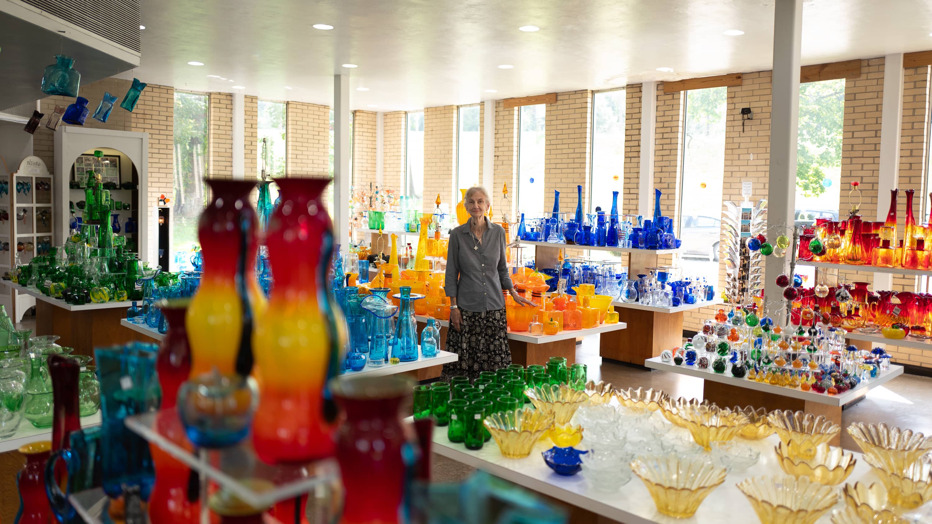
galleries of images
Here’s a little gallery
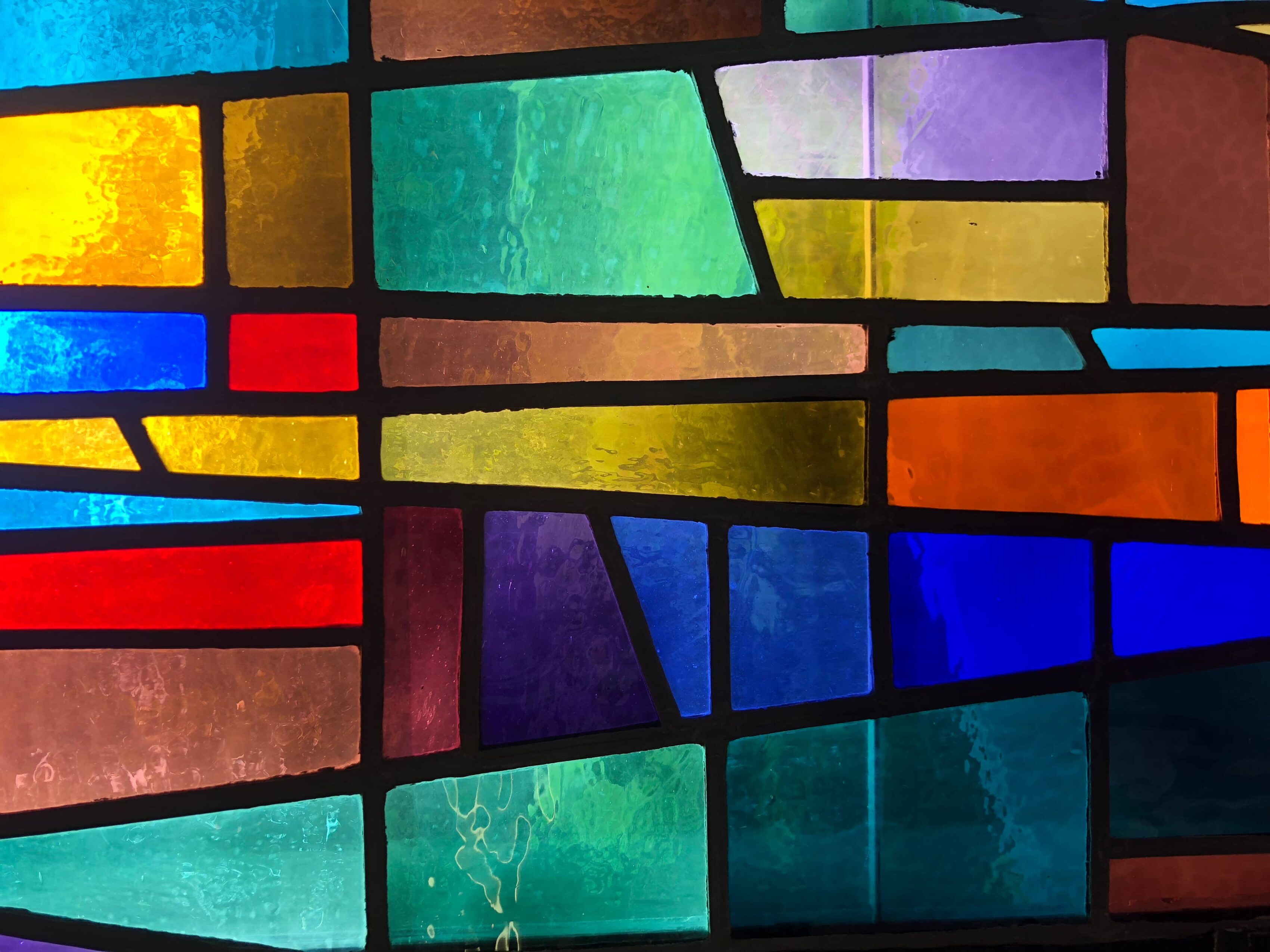
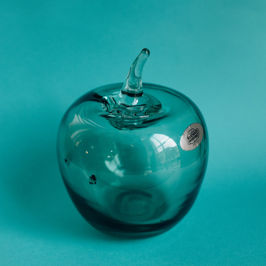
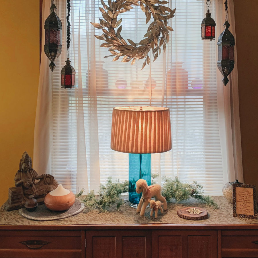
Back to Blenko, here are a few of images I have related to the glassmaker. This gallery has no width applied, so it stays bound by the main narrow column of the page.
It would be somewhat unusual to have galleries stacked on top of each other without some additional flourishes of context, even if that ended up being just a really, really, long run-on sentence. There’s an invisible spacer that is forty-two pixels tall under this paragraph.
Here’s a gallery set to “wide”


One would not likely use two columns in such a narrow space, but again, this is just representing the possibilities of the block based WordPress theme.
Think of it like trying to design something in Microsoft Word. It’s terribly persnickety. One day I figure websites will be more like Powerpoint and you can move stuff everywhere.
And one more gallery, this one set to “full” width


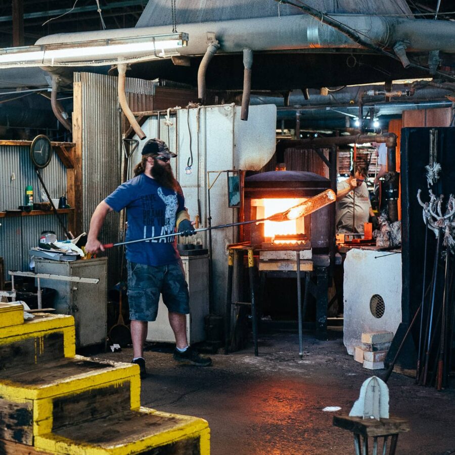
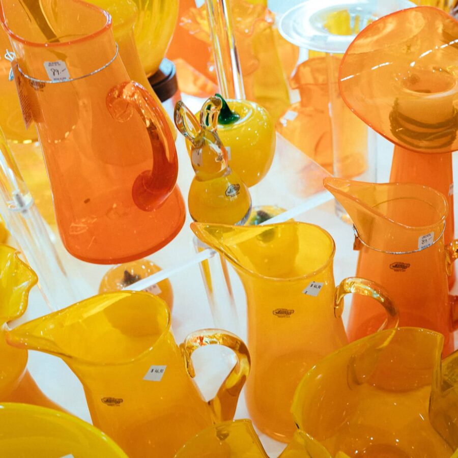
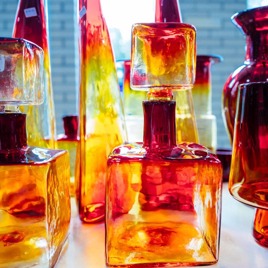
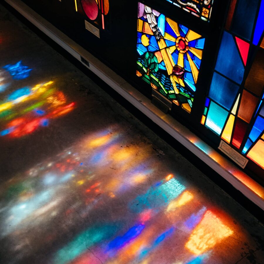
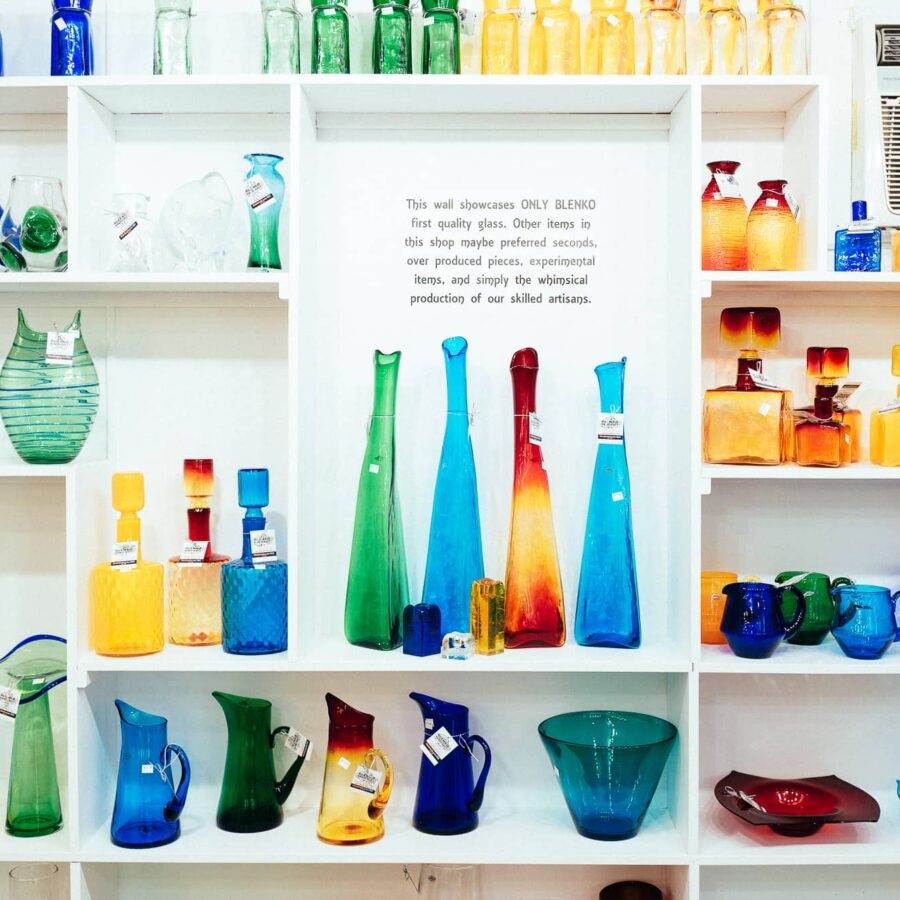
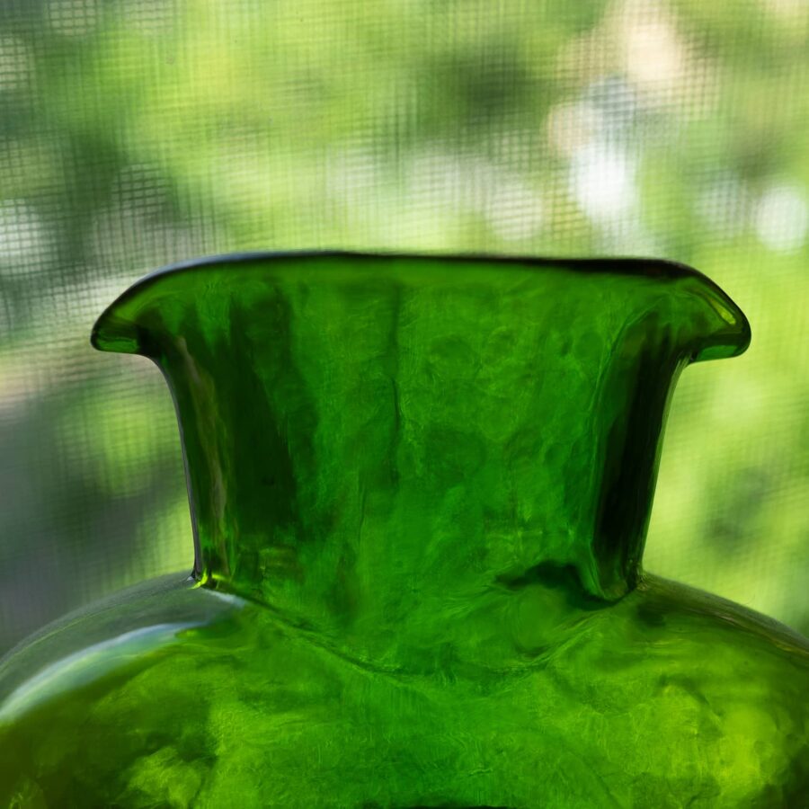
That about wraps it up for gallery widths. Things can get spiced up by having an odd number of images. One day I hope there’s a pattern to make varied grids (masonry) with low overhead or set width priority for certain images.
I try not to get overly hung up on design details and think of this place as a visual garden*. It’s more important to plant seeds as things can be transplanted later.
* This metaphor needs work. (Also? This is footnote is set to “small.”)
Buttons — they’re not just for pants!
There are two styles of buttons, filled and outline.
This is the multi-media section
Hey, listen! 
Here’s a little audio clip of some pigs:
Video action
Testing out a camera that follows me around the room, plus Edie! This video is hosted on my website.
This video embed is from YouTube
Here’s one from Vimeo!
Music Embeds — According to Last.fm, I’ve listened to this song the most on Spotify
My friend Zan posted this track on SoundCloud
Postnote:
I feel like a serif would be nice to re-introduce to the site. In order to do that thoughtfully, one must make a plan. This page is a foundation for thinking and playing!

