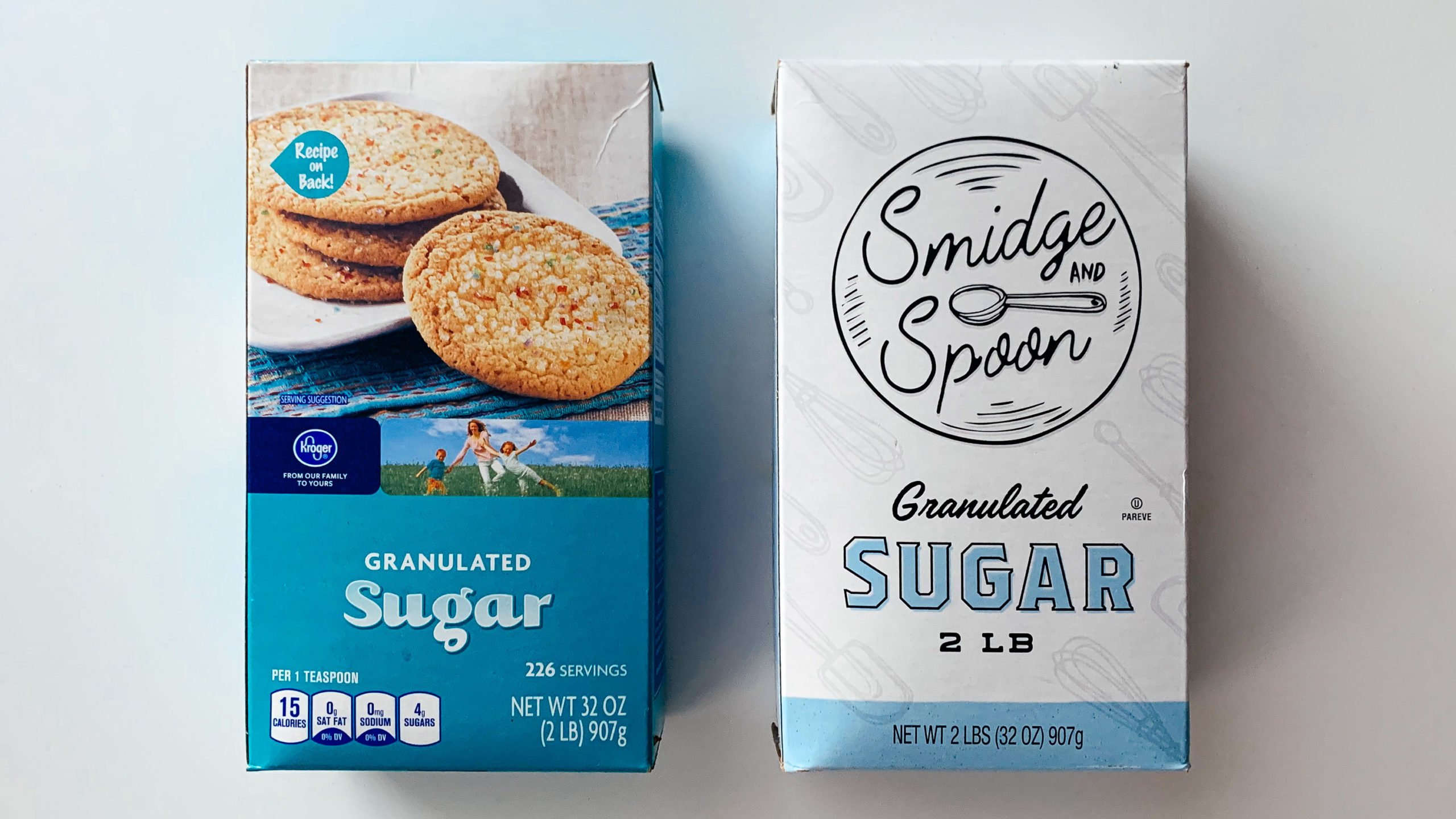
An update to Kroger’s packaging and branding for sugar. (The new one is on the right, which isn’t a great sign it was a successful redesign.)
I get what they’re trying to do here. I just don’t think the dart quite got to the board. Perhaps I’m missing the color photograph of the family expressing their joy of sugar.

