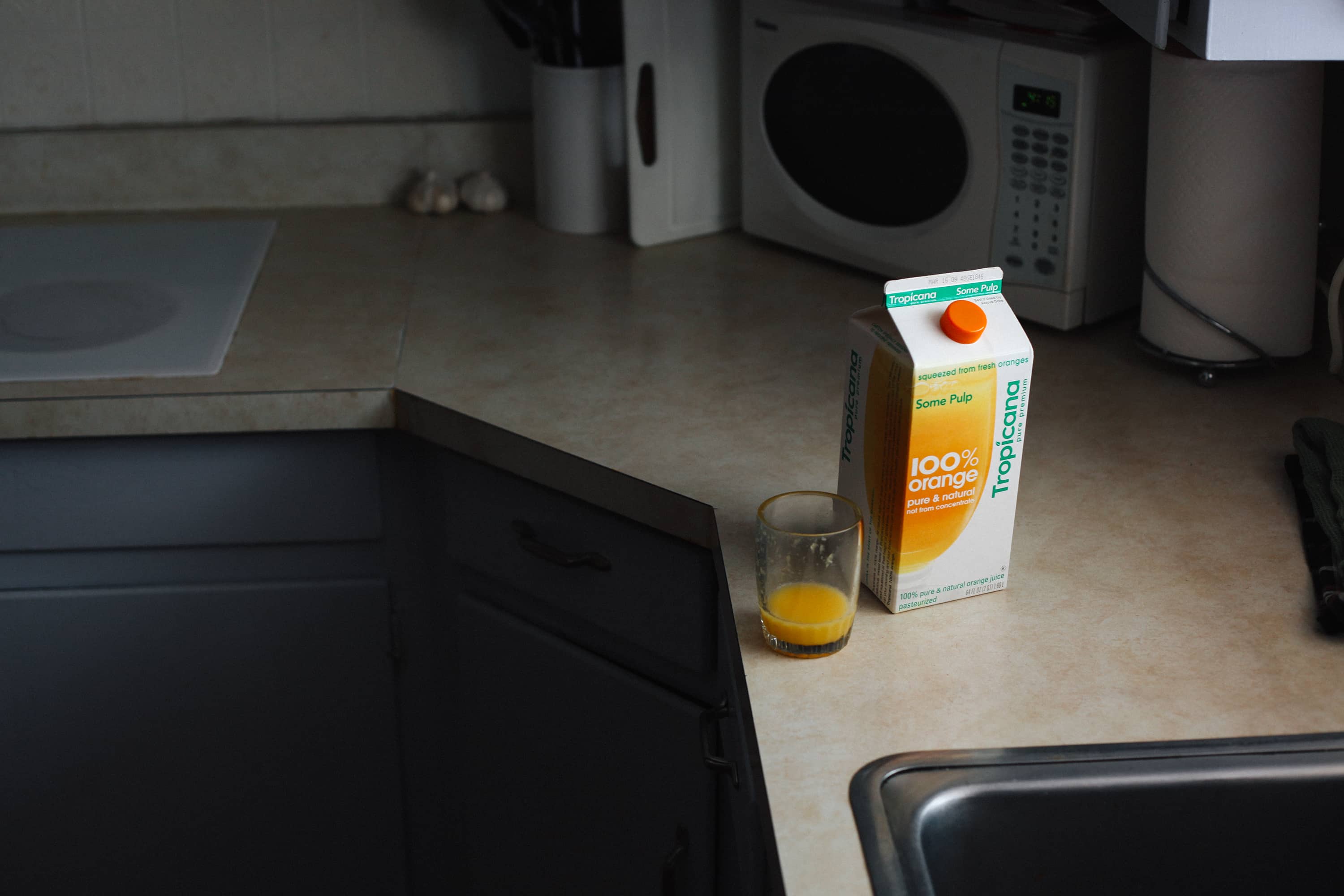
this is not about the counter top

Finishing up the orange juice, I realized this fabled carton design won’t be around much longer.
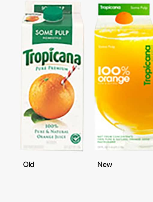
When Tropicana moved away from the big-orange-with-a-straw illustration to this sparse treatment, reaction was strong… folks called it generic, unpleasant, backwards, and a slew of other things.
And from a usability perspective, there was some loss for those that shop by color (Khoi has a nice thoughts and collections of both old and new packages on his site)— though I have to admit, I shop by words because I never know what the colors meant.
Some pulp. I just want some pulp.
Anyway, the old carton is coming back.
I’m not trying to be contrary when I say, I kinda liked the new look. Sure the straw in orange was nice, but I liked the simplicity.
This of course, is coming from a guy who goes to Target specifically to buy boxes of tissues that have no designs whatsoever on the outside, just solid color.
I don’t always shop by words.


You’re the second person I’ve heard to like the new design. I’ve been a bit indifferent about it. It looked nice, and it was well done, but it also seemed like it was designed modernly for modernity’s sake. I wasn’t convinced. It’s orange juice, for Pete’s sake! Besides, I like Most Pulp from Florida’s Natural. :)
I was among the haters of the new packaging (although I hated the weaselly apologia by Peter Arnell, CEO of the redesign firm, even more).
But I am also among the few, the proud, who shop for the same Target tissues for the same reasons. And here I thought I was special!
I’m a Target tissue-for-the-box-design buyer, too! Drives me crazy when my boyfriend comes home with the hideously ugly Kleenex boxes!
Overall, I liked it. I do think that instead of “100% orange juice” right in the middle, that space should have shown the specific type. I think the uproar really came when people would make it home from the grocery and realize they had purchased the wrong type. I did it twice in a row before I figured out the colored band behind the opening.
I’ll miss the new design, myself. I couldn’t read the colors, either — but we never had a chance to build associations with them, as we inevitably would have, in the case of a product so rich with Pavlov-tastic visceral cues. C’est la guerre.
Interesting time to be Mr. Arnell, between this and the Pepsi PDF leak.