Can’t say I loved where it was…
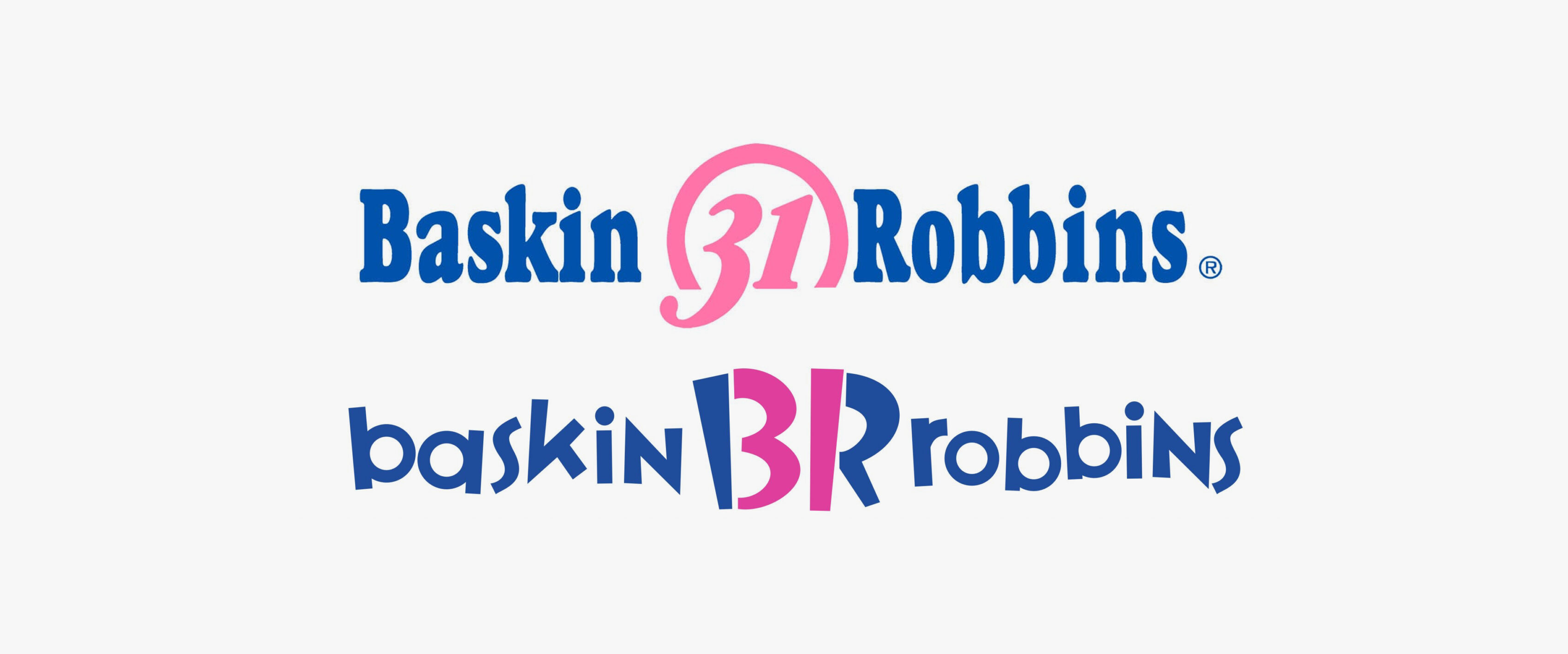
I just noticed the new Baskin Robbins identity. Digging up facts I found the culprit (I think).
The nod to Emigre’s Variex isn’t something I’d have considered, but squeezing the 31 in there is… admirable.
I can’t articulate my distress enough, but more googling provided this fine quote from a thread on Speak Up, “Because, dammit, ice cream should be fun.”
I think I like the olde olde one…


That has got to be one of the most awful logo updates EVER. Blech!
uh….yikes. i’m all for updating logos but that one bites. and i don’t mean ice cream. aloha, chuck
Oh lord. Yet another silly stupid redesign. It’s barely legible all skewed like that (especially in that photo on Speak Up). It’s clever but I have to look toohard to figure out what it says.
Silly, silly designers. Who are these companies? Who are these designers?
I have to say, I actually really like this one.
I think the New logo is Great Helps Us Compete with Coldstone. Yes There Are SOme Complaint more From The Older people That Grew up with there logo but for a New Generation I think Its a FUN logo to Grow up With
I think the New logo is Great Helps Us Compete with Coldstone. Yes There Are SOme Complaint more From The Older people That Grew up with there logo but for a New Generation I think Its a FUN logo to Grow up With